
On the app, one can’t (yet) propose changes.
2 Likes
Correct, the app is still in beta and it is on my to-do list 
If you’re curious about what else is on the list you can check them here:
Mobile Features
https://sharing.clickup.com/l/h/6-33311511-1/966de24eb914efe
Mobile Bugs
https://sharing.clickup.com/l/h/6-63502259-1/e70886df2459789
Complete list for both mobile and web
https://sharing.clickup.com/l/h/4-4642120-1/3308c6d671ff3ac
2 Likes
In card management if you use the select all box to highlight items, then run a different search the box will stay highlighted and will work in a way visually opposite of the toggle.
vod or it didn't happen
2 Likes
1 Like
Good question! I’m afraid I don’t remember well anymore if it had a reason, but will put it on the list to check and add if possible
1 Like
I hate it when I get an answer wrong and when it was a stupid mistake like a typo in hiragana e.g. in my head I know “hey, click retype” but before I can stop myself I click enter… and if I hadn’t clicked over it, I would’ve used a retype option. It’s the most painful when I was about finally level up a leech but my stupid finger just couldn’t stop for a moment.
Just like @FlamySerpent pointed out in another thread, It would be awesome if there was an option to delay going to the next card after getting an answer wrong. So if I get an answer wrong and press enter it wouldn’t allow me to go further for another second or so.
4 Likes
Noted!
3 Likes
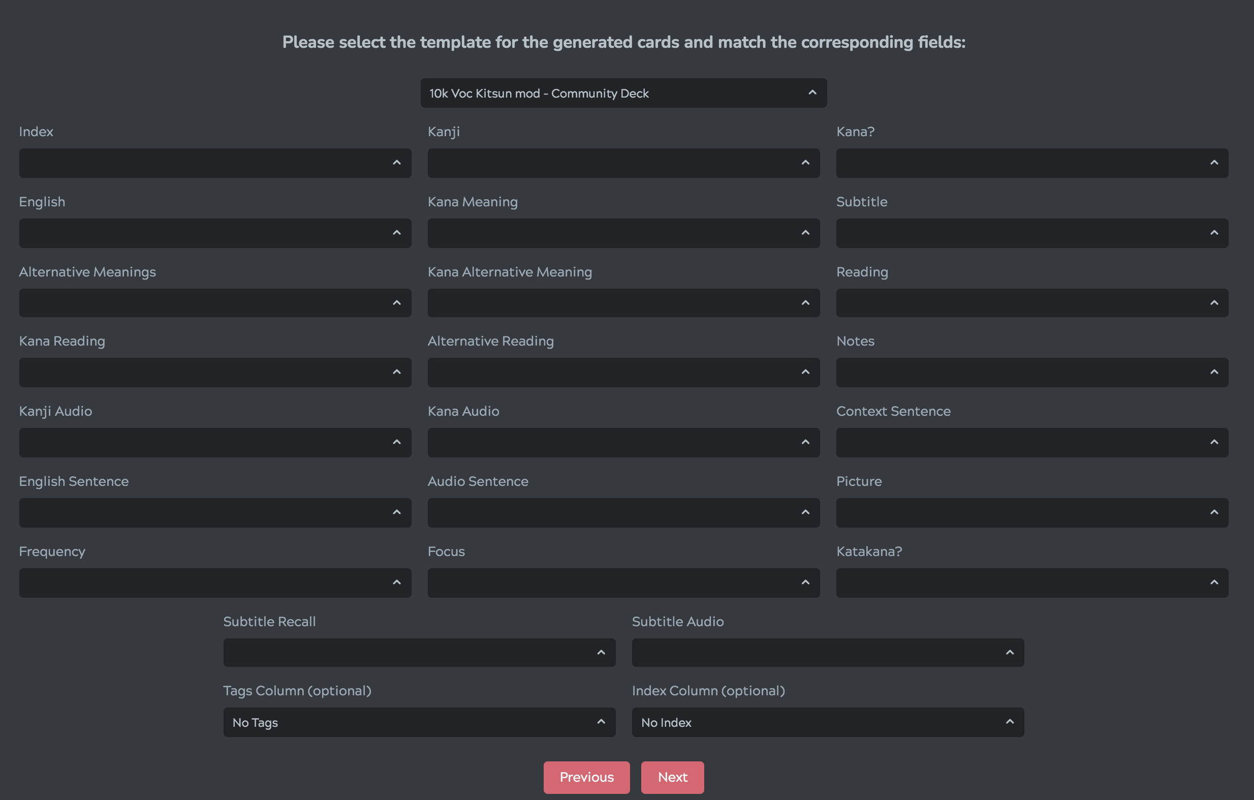
Is there an option to change what symbol separates definitions? I occasionally like to add sentences/paragraphs cards (in English), however, the ‘,’ or ‘;’ kinda messes up things.
2 Likes
Do you mean for inputting answers or for displaying information? If the latter then it depends on the syntax used, if the former then I’m afraid not. Kitsun splits answers on , ; and 、 (fullwidth) although putting in a whole sentence should still work I think.
1 Like
@Neicudi please, put the “Know”/“Don’t know” buttons in the same order on the android app and website, I just marked “それは少女向けの雑誌です。” as not known because I clicked too quickly with the wrong layout in mind x_x
Also, the buttons should probably not be so close to each other, and should absolutely not be at the same place as the “Show button” 
1 Like
I’m afraid there is no other space for them on mobile devices as placing them elsewhere would either:
A. interfere with some layouts
B. Not be in quick reach of your thumb (say we’d put them at the top).
By placing them at the same spot as “Show” or “Flip” it makes it real easy to tap through your reviews.
As an alternative, I’d suggest to give the gestures a try. swipe up to flip the card, left and right to mark correct or incorrect (you should see visual feedback whether it will be marked correct or incorrect). I find that even easier to use with the app 
Regarding the know/don’t know order, I’ll check why it was that way again (I recall something about the left/right swipe gestures being on those sides)
2 Likes
Maybe the “show” button could be in the right corner where the “ignore” button is for other cards? That way, an accidental double click wouldn’t have any negative impact.
tbh, I would like an option to get rid of the gestures because I keep on using them by accident  (actually, the button placement and the accidental use of the gestures are the reasons I stopped using the web version on mobile for reviews after accidentally failing a few items while walking :x)
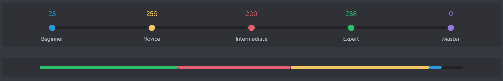
Something I found confusing and seems unintuitive. The SRS interval count “dots” go from left to right (Beginner on left to Master on right). Meanwhile, right below it, the colored bars for the SRS intervals go right to left (Master on left to Beginner on right). Is there a reason for them to be swapped like that? It seems like it would make sense for both of them to go from left to right.
1 Like
@ Neicudi Is there any way to see a summary of the lessons/reviews I’ve just done even after I exit the summary page kinda like what WaniKani has?
In other words, being able to click on the black review tab for example and being able to see my past reviews.
1 Like
Kitsun holds the last reviewed/learned items in the current browser session, but as soon as you start a new session this will be wiped out as it’s not relevant anymore (due to either starting a new deck or just starting a new session).
I can think of a few ways to add the functionality you’d want on a per deck basis, so I’ll put it on my todo list 
1 Like
Hi @Neicudi !
I don’t know if it has already been asked but is there any way to change the reading from horizzontal to vertical in “My Texts”? If not, could it be implemented in the future? I’m currently using that section to one day being able to read physical books, so that would be great.
1 Like
Hey! Yeah sure, I think it would be a cool addition! I’ll put it on the list ^^
2 Likes
Very minor
I wish ctrl+enter / cmd+enter would work for ‘save’ when doing quick edits on cards.
1 Like
IIRC, you should be able to do CTRL+S and/or ESC to save and close the popup. That might help a bit already!
Oh thanks, this will work just fine 
1 Like