Btw, such a cool concept for a thread!
Mine:
-
I have to go to each card in order to add it to lessons. From the search page, this adds more clicks than it normally would if I was hibernating them for example.
-
I sometimes wanna refresh “My decks” page, but the only way to do it is by either refreshing the page or f5. There’s no top left symbol to click on like we have on WK/WK forums/Kitsun forums/Bunpro/Bunpro forums. Maybe allowing to click on “My decks” again (even if you’re already on that page) could be the best idea to fix this.
-
The size of how everything looks. I mean, I can reduze the resolution and I get it solved, but the first impression of mine about Kitsun months ago was that everything looked big. I’m sure I’m not the only one.
-
The rounding of the % of cards learned in the cover of a deck being different than inside the deck itself.
-
I have a feeling that with “Filter Siblings” on, the system is getting somehow biased on the layouts it shows me during Quiz. Specifically, on the katakana 4500 words’ deck, I feel like it’s giving me JP => EN a lot more often than EN => JP. This is annoying because EN => JP is the actual difficult part for katakana vocab. Everyone can read katakana words, but not everyone recall/can use them.
I do wish there were some new features, particulary a way to identify leeches, review them (outside of the SRS system) and maybe add them back to the lessons’ pile. I feel like just identifying them and adding them back as lessons would very much be enough (80% results for 20% of the work). But I recognize that there’s so much to implement on Kitsun, so  No pressure.
Also, I really wish I could like… idk… start donating? I use Kitsun so much and it being free isn’t fair for the project. I’ve said this to you several times already @Neicudi . If I could donate for the betterment of Kitsun, I’d do it today.


 I agree with these.


 Not really necessary if what I mentioned gets solved.
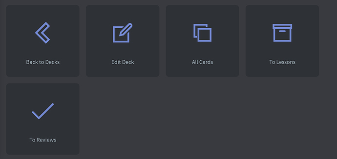
 unnecessary. I never used them. I was the one asking for the “Back to Decks” one, but mainly due to the fact that it’s easier to click there when using a smartphone (than having the side tab open/clicking on the symbol). But I think the side bar has improved since then (and I now use it always closed on mobile), so it might not even be necessary anymore?
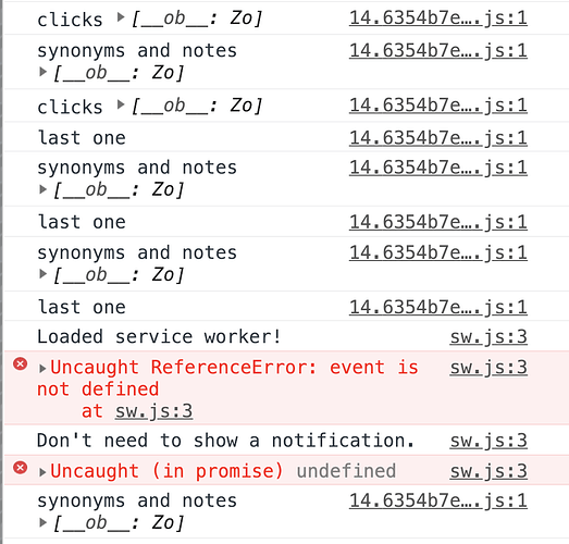
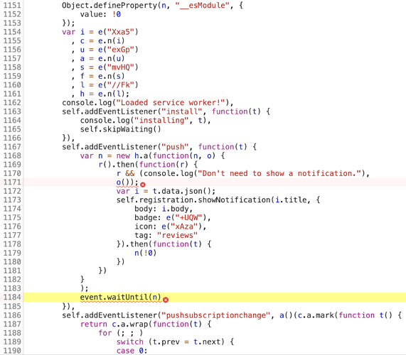
  Like some secret messages left behind by the devs
  That said, I do clear up logs every once in a while. Guess its time for another round.
