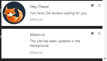
Oh maybe it’s a different one. Usually this pops up because the notification was blocked.
Is there any other reason why the notifications don’t show up anymore? I actually want them to appear 
Could you check the permissions in the browser?
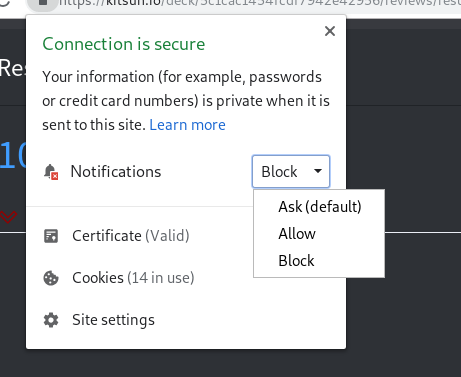
On chrome it should look like this:

But with the setting as “Allow”.
Normally the notifications only appear if you aren’t already focused on Kitsun in your brower.
That said, it does give an error in your console along with the log ‘Don’t need to show a notification’. That log meant that the kitsun tab was focused iirc.
It is already set to allow notifications, I suspect that the browser on my mobile phone is “stealing” them.
However, I tried both leaving the tab in background and active for a while, the errors don’t appear then. I only see them during reviews, and they are quite frequent (like 5–10 of the first type, maybe one in a few minutes, and occasionally type 2).
Huh, you get multiple of these during reviews? That’s not supposed to happen at all. Do you always get it or only when you are supposed to get a notification?
I always get the Uncaught (in promise) DOMException, 7 times for 250 questions in 10k just now. The sw.js error occurs only occasionally, maybe it is related to the time. The notifications are allowed, though, so that shouldn’t happen anyway?
Edit: looks like it’s more frequent for lessons, also 7 in 20 lessons.
I took a look just now and I did find where the error is coming from. I fixed it (and this should also fix the double notification I hope @jprspereira )


EDIT:

The change isn’t live yet 
oh 


Two minor annoyances:
-
The audio prompts: if I want to replay the audio, I have to use the mouse and click the button, which makes the input box lose focus, so I have to use the mouse again and click the box before I can type. I’d really like a way to have a keyboard shortcut to replay the audio without taking my hands from the keyboard. Yes, I know there is a hotkey for that, but it doesn’t work when the text box has focus. And I can’t seem to find a ctrl or meta keycode that doesn’t already map to something or even get the settings box to accept them.
-
Almost too minor to mention, but the forum header doesn’t have a link back to the site.
The audio is also a minor annoyance for me, would it be enough to disable selection for the button element?
New (old) minor annoyance:
4. On mobile the next/flip button is very small, would there be a problem to flip by tapping/double tapping anywhere on the card (for the know/don’t know card only)?
-
Luckily, this has been requested before
 Right now you are able to bind the hotkey to one of your F1-12 keys in order to play audio while the focus is still on the input. You might need to check which F-keys have no browser action assigned to it by default.
 -
Yep, totally understandable and on the to-do list!
@acm2010 I’m not sure about that, it’s worth a shot! 
I’m a little bit reluctant to add gestures/taps as it might be might accidentally trigger for others.
That said, creating a setting out of it might fix that problem.
Edit: I’ve found a way to keep the focus by returning false in the mousedown event. I’ll add it with the next update. Not sure how well it will work in every browser though, gotta test 
This was also partly added because I asked for a “Back to Folder” for decks in folders (because otherwise it gets annoying looking at decks within a folder) and this was the navigational equivalent for decks not in folders. I wouldn’t want to lose the “Back to Folder” button, though I wouldn’t object to that navigational ability being handled in another way.
My minor annoyance:
It really bugs me that the card numbers shown on a deck’s picture and within the deck are both called “Total Cards”, even though they’re giving you different information. I wish the number on the front was called something like “Active Cards”.
It doesn’t bother me, but it makes sense 
In a perfect world, which data would you want displayed where and how? Disregarding total/active, would it be better to display a total of active cards always, or a total of all cards regardless of state?
Well, what bugs me is just that they’re called the same thing. I do like knowing both numbers, and honestly I think their locations are the sensible way round. The one in the top-right of the deck dashboard could perhaps display ‘Active’ on hover as well.
Noted!


