
I never bothered to look either until you mentioned it. Kitsun-Dark is really nice, easier on the eyes too 
4 Likes
Super minor here, but I’m starting to gather quite a bit of texts, and It’s prolly gonna be getting worse really fast as I’m getting a lot more comfortable reading. Is there any plan to put a function into the reader that lets me organize them into folders?
3 Likes
Not yet, but I can put it on the backlog list 
2 Likes
You know you’re like the bomb.com. (yes im a 90’s kid…) but seriously. Cant overstate enough. I hope you’re treating yourself well amongst a world that’s garbage atm.
1 Like
This is a minor design suggestion: The 10K Kitsun - Optimized deck is fantastic, but it would be nice to be able to turn off the textured background. It reduces the elegance of the animated rectangles: the edges look ragged. A solid color would be preferable (for me at least).
1 Like
These may be on your list or suggested already so please ignore if so. 
It’s great tags are in the cards now but they kind of blend into the note section. Is possible to keep more distinctive (or keep the format just in Manage Cards?
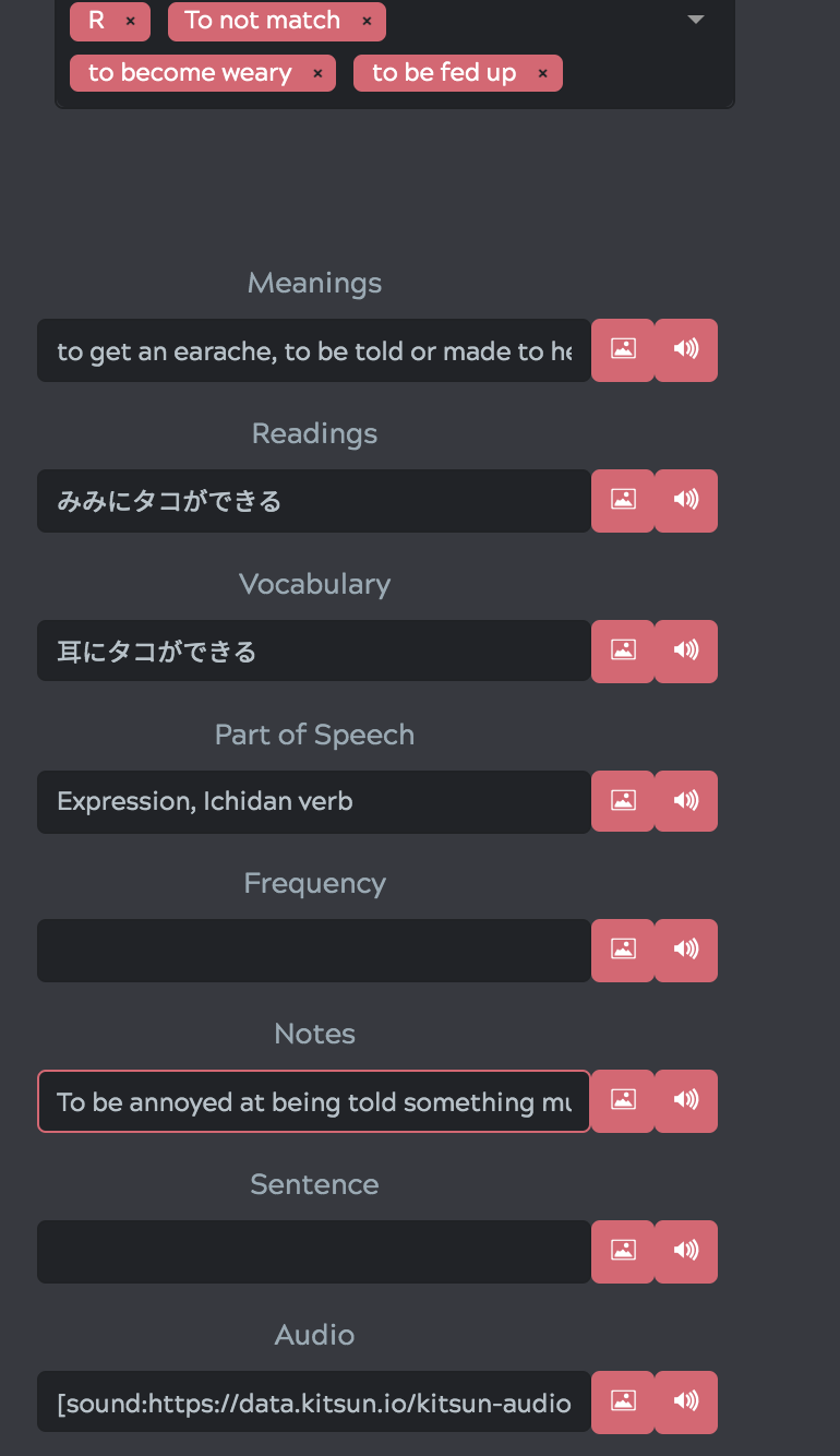
It would help to have a value preview of a sample card for importing decks. My anki deck imports have mostly been trial and error to this point based on what will I think will fit the template best. BTW, this deck looked well polished deck (mostly interested in the native audio) but I didn’t know what template to use (needs two jpg slots). I tried Hine’s template, which are awesome, but there are so many possibilities. If there is already an easier way, I’m not aware.
Lastly, the card edits value character spaces within manager are very short to leave room for the card preview. It would help if the space values could expand in some way (or a way to hide the card preview to make space), some sample sentences or notes get very long. This is also true when reviewing feedback from a published deck. There is always a lot of ![]() to read through and edit (especially if using html tags). In the card creation, the values have a lot space which is great.
to read through and edit (especially if using html tags). In the card creation, the values have a lot space which is great.
1 Like
I could put a break line above it, that would probably do the trick?
Agreed, that’d definitely be nice and in line with some other ideas I had about displaying card previews. Displaying images in a preview during import is a bit more difficult though, as the images haven’t been uploaded to Kitsun yet at that point.
Agreed as well, will check if theres a way for the user to resize the preview according to their preferences 
I think that will work well, thx!
1 Like
It’s likely that this has been mentioned (but I’m being too lazy to read through this whole thread): I can all too easily submit a blank field as an answer in my reviews. Is there any way to prevent this?
p.s. I’ve actually just discovered Kitsun, and find it a lot more user-friendly and appealing than Anki. Coming from Wanikani, I appreciate the familiarity. Consider me a likely convert. 
4 Likes
Hey @ToffeeFox! Welcome to Kitsun 
Do you mean it is not being marked as a wrong answer, or just that you don’t want it to submit unless you input an answer in the first place?
1 Like
As in I don’t want it to submit the answer unless I have input something (as it is with Wanikani). I assumed it would level down my review as being incorrect?
2 Likes
Ah I see! It only actually levels it down once you “submit” the answer by advancing to the next card. On the backside of the card you can still undo the answer (hitting ESC or clicking the ignore button)
4 Likes
Aha! Great news. Thanks for the tip. 
3 Likes
Hello @Neicudi
I’m coming from WaniKani and started using this site for practicing the JLPT Vocabulary.
I really like the JLPT Decks a lot and I will work my way through them!
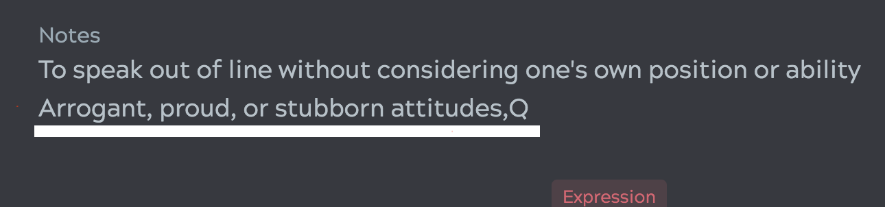
Just a minor annoyance, but I noticed some of the example sentences are off. The numbers and dots are missing, for example in the sentences for “乗る” (11 missing) and “貸す” (dots missing).
As far as I can see the sentences have been copied from jisho.org so maybe it can be fixed in one go?
I thought it would be better to post this issue here instead of proposing changes for every card.
Greetings!
2 Likes
Hey @jaeschl, welcome to Kitsun!
The example sentences in those decks came from tatoeba which is also where Jisho.org sourced their sentences from. I’m not sure what happened to the symbols, it’s possible that they were filtered out by accident while importing the data into Kitsun.
Thanks for letting me know! I’ll check if there’s a way to fix them all at once
3 Likes
Hey @Neicudi.
I noticed that when I finish my reviews, I have the option to do a “quick study” on the cards I got correct / incorrect. However, this is not something I seem to have the option to revisit when I leave that page. Did I miss something?
I suppose it might seem counterintuitive, and I should just let the SRS do its thing. But sometimes, given the chance, it might be nice to review my mistakes an hour or so later - especially at the end of the day when my brain has seemingly packed its bags and gone home. 
3 Likes
You can also start quick study from the cards management table. Just select the cards you wish to study and select Quick Study from the actions dropdown You would have to remember which cards you got wrong in your sessions today though, but that might change in the future as there’s been feedback about that before
In case your wrongly answered items get answered wrong multiple times, they start to show up as leeches on your deck dashboard. From there you are also able to use quick study for all your leeches at once.
2 Likes
Good work @Neicudi on bringing the two versions together (I’m very excited to get my hands on the Kitsun app).
My 2 cents on the new CC design for desktop: I find that the name of some decks is quite hard to read as the thin white font can easily mesh with deck images that have lots of white or letters or both in it. I also just generally think that the title, author’s name, rating, and card/users count shouldn’t take 50% of the deck image, especially considering that they were all chosen (thus far) taking into account the old design so lots of them even have the title of the deck on them or something indicative of it and do not accommodate for the overlaid space in the bottom half of the deck image.

The mobile version looks much better and I wouldn’t want to change it at all since usually (due to the longer length the images are given on a one by one display of the deck list).

Similarly, the desktop version looks much better if I zoom out by 20%, the main reason being that the titles now all take one line and the images are cropped vertically (top and bottom) rather than horizontally (left and right sides) which makes it more like the mobile version and better looking to my eyes.
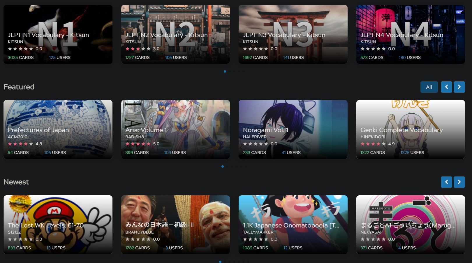
Conclusion: I’d love it if it looked more like the 80% (second desktop picture) than the 100% zoom (first picture). It would also be nice for the title to be bolder (maybe with subtitle-esque black outlines to make it stand out in front of a panoply of colors).

2 Likes
Hey!
Thanks for the feedback!
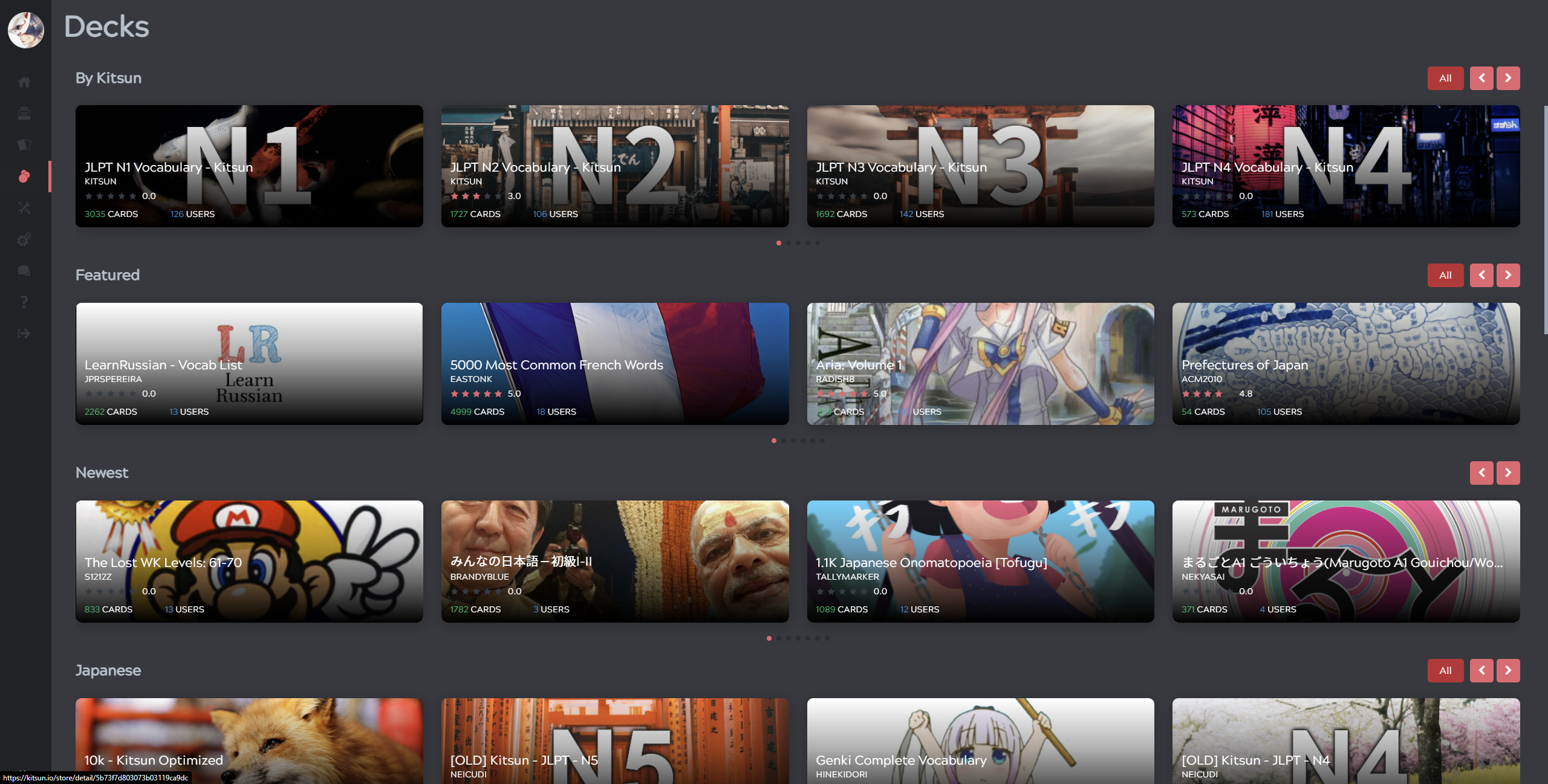
What you describe has to do with the resolution and ratio of the screen. It seems that your resolution is close to a breakpoint where it should be changing to having 3 decks per row.
What browser zoom does is fake a higher resolution, so even if you are for example on a small laptop screen with a 1366x768 resolution, you can trick the browser/website into thinking you have a 1920x1080 resolution/screen and it will style accordingly.
This is how it looks for me on 1440p (2560x1440):
So to get to the point:
The 80% look is not easy to get when your native resolution is lower than what it fakes to get that view. This can’t simply be solved by making the text smaller or anything because the actual screenspace you have is still the same. Meaning that displaying 4 decks will always make it look like squares rather than the long rectangles you see on my screenshot.
What I can do however is change it so that you see 3 decks per row at your resolution, so that it at least won’t look so cramped. What do you think about that?
Could you also let me know your resolution so I can run some tests?
3 Likes
This would be great!
1 Like