moar levels please @Neicudi
Congrats! 
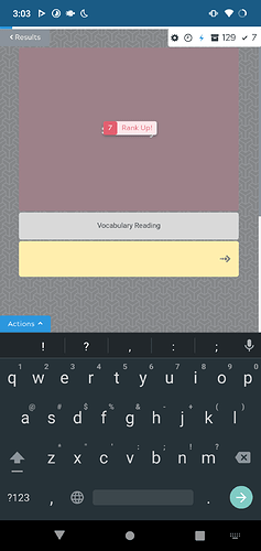
When doing reviews on mobile, the level up icon floats across pretty much the entire screen. If I’m in lightning mode, the icon covers up the next item I’m reviewing for a split second. I would prefer to just turn this icon off entirely, but somehow fixing it to not be such a flashy “move around the whole screen” animation would work.
Alternatively, I could just live with it. I’m only annoyed by it because I’m returning from a break and doing hundreds of reviews of really easy material right now.
Yep, no layouts are bound to specific decks.
As for having the option to generate cards with other layouts in this template:
That’s exactly what the custom flashcard button is for. Once you set it up once, it will be remembered for next time, exactly like what you are asking for if I’m not mistaken. In both cases you’d have to set it up once.
Try it out with a few cards, set it up once and then generate additional cards sometime afterwards, you’'ll see that it saved your settings and you can just click through it.
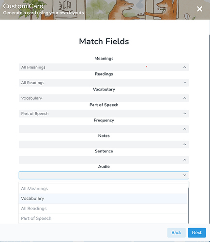
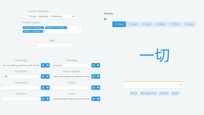
Just to return to this, I’m noticing now that audio is incorporated into the site that it doesn’t seem to come up as an option when custom generating dictionary cards, but does exist for default generated cards. At the risk of sounding like a broken record, I really do feel that it would be vastly better in terms of workflow if we could set default layouts on a deck by deck basis and then have the ‘generate default card’ button make a card according to those defaults, reserving the custom generate for the rarer occasions where we want to deviate from a deck’s usual card type. But if I’m in the minority here, I’d at least like to be able to include audio in the custom cards I make from the dictionary.
Thanks!
(Trying to custom generate card, with no audio option available on the drop down menu)
(The same card, default generated, with audio)
It’s annoying when the “Rank Up!” floating notification covers up the text in the next item’s text box. I have to wait until that floater goes away to see whether I should be inputting a reading or a meaning.
Hey!
Yeah the custom flow is a bit bothersome to use if you have multiple decks which each need different custom cards. One idea that has been talked about is being able to make presets that you can choose from once you open the popup. So your different flows would all be saved and selectable. Obviously this would make it a bit more difficult to implement again as you’d probably also want to name/edit/delete the presets at some point, but I think it would be a cool addition. What do you think about something like that?
Kitsun will probably be switching to another audio provider in the near future, so I’ll make sure to add it to the custom popup when that time comes!
How would you prefer to see the rank up notification? Sadly it’s a bit difficult to put it at a certain spot because of card layouts all being different from eachother (an input in Card A could be at a totally different spot from an input in Card B).
I can make a user setting that disables or changes the notification, but it would have to keep the problem above in mind.
Thanks for the response.
Maybe in a corner or near the top of the screen? Even overlapping the prompt kanji/word is better, since those are much larger than the text box so you could read them even with something floating over them. Overall anything is an improvement in my eyes. 
Thinking a little more about it, a good spot would be at the very top middle of the screen. Unlikely to overlap something key, and still very easy to see.
Cheers, I remember that some of the older decks have hints in that of the screen, but in that case they could just use the original animated notifications instead 
I’ll put the setting on my todo list 
Thanks, yeah, I think that would be a good solution if you find the time!
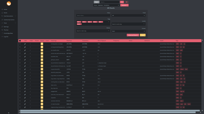
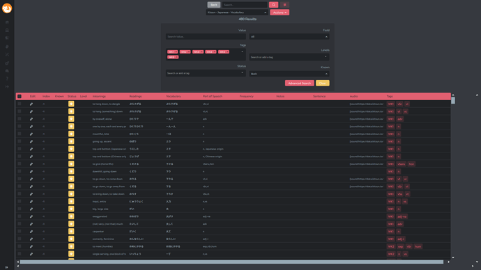
I’ve only just started actually managing my cards and hibernating, so it might be that I’m missing something very obvious. But the only way for me to scroll through my results is to zoom out an insane amount. It seems to load in two scroll bars every time, and I can only access the right one by zooming out. (See screenshots). I don’t know whether this is a bug, of if I’m missing something. I’m on firefox 86.0 (64-bit), if there is any other information needed, feel free to let me know.
At this zoom level it still shows one non-functional scroll bar still :
Need to scroll out 'til here for the correct right scroll-bar to appear :
It’s not a big hassle, as I can just zoom out, but it is a minor annoyance, so thought it fit the thread 
The double scrollbar is definitely not supposed to happen at least, so that’s a bug! Probably introduced with the new known column.
The vertical scrollbar being all the way at the side is a bit annoying for sure, and I’ve tried in the past to change it, but I’m afraid it’s not possible for now. That table only loads in certain rows while you scroll (to prevent the browser from overloading itself if it shows 20.000 cards) and the vertical scrollbar is baked into the component because of that  I’ll try to give it another shot, but I’m fairly certain it was not possible last time I checked.
I see! Well, as I said, it’s only a minor annoyance, so no problem if you don’t get it fixed. But thanks for the quick response!
Helloooooooo!
I tried to search around to see if anyone else is having this issue, but it looks like it might just be me. ^^
Firstly, I just wanted to say that the Known Words system is really cool and a brilliant idea. Sometimes I go to add a word only to discover I’ve already made a card for it…  That said…I don’t think it functions the way I make cards.
I try to learn new words with their collocations, so I put things in parentheses I want to see (but don’t necessarily want to type) to take advantage of the way reviews ignore them. However it doesn’t seem like the Known Words system interprets parentheses the same way.
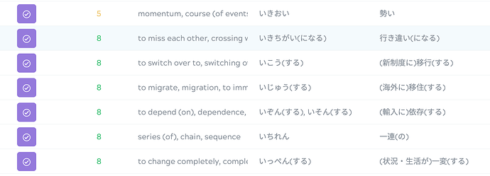
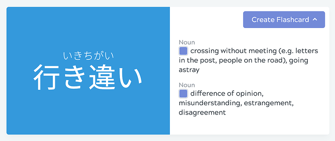
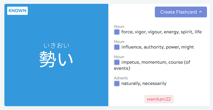
For example, it seems like 勢い registers as known, but not 行き違い. So I was wondering if it would be possible to have the Known Words system ignore anything in parentheses like reviews do? 

I think it’ll be useful for people who study words with particles (e.g. な-adjectives) or する verbs, while not changing any of the functionality for people who are already using it either!
How come the focus is not on the input box by default ?
I have to use ‘tab’ to be able to input my answer at every card, and then I go to wanikani and have to refrain this tab habit, then I get back here and have to tab again. Gaaaah !
Also, I set audio to Autoplay for front and back of cards but after a correct answer I have to refrain myself to hit enter before the play is over, else it just gets cut.
I would love to have the audio to keep playing while I’m discovering the next card, it would be soo smooth! (like on wanikani xd)
Besides that I’m very glad on my first steps here and I may get lifetime in the end of this month, having these fixed may convince me 
Did you enable “always show flip buttons” setting in the deck settings? If that’s enabled the system assumes you want to use those buttons (or mobile swipe gestures) so it does not focus the input (to prevent the touch keyboard from popping up on mobile devices/touch capable laptops etc). Disabling that setting should make the auto focus on the input work 
The whole front of the card is unloaded from the DOM/Memory at the moment you flip the card or go onto the next one, so sadly it can’t continue playing as the audio player and the audio file itself is also gone at that point. 
Glad to hear that you like it! Thank you so much for the support if you do decide to get lifetime! 
Hey @andrewkaz!
I think what you’re saying makes sense to add, although I can kinda imagine situations where you would not want that to happen (false duplicates). I’ll put it on the to-do list though, as I think those situations are more rare than your situation  Thanks for the feedback!
Problem solved !
You were right I had this setting on.
I didn’t know what it was so I turned it on to see what it was.
Now I know xd
Thank you
I understand that it will not arrive soon but I’m still hoping that there will be an update which will make it able to keep 2 cards in the DOM/Memory at the same time and unload the previous one after the sound is done playing to allow this 
Sorry if these have come up previously - I did a (very quick) review of this thread and didn’t see any of these issues:
- I would love to see an option to only show the back of the card once all siblings are completed - that way you can get tested on reading, then meaning without the answer for one spoiling the other.
- I love lightning mode, but I also love having the audio play when I flip each card over. Would be sweet to have audio play during lightning mode. Even better would be having the option to play audio only once, after all card siblings are completed (or just after “reading” layout is completed).
- When managing cards and “Adding to front of lesson queue” I would love to see an option to add the card in both the Vocab deck and the Sentence deck simultaneously (using the core 10K deck here).
Overall very impressed with the site (just signed up for lifetime) - keep up the awesome work!!

