While I like the delay siblings feature a lot, I wish there were a separate toggle for the quiz after a lesson. When testing a lesson I’ve just finished going through I want to drill all the possible sibling variations at once, not delay them! As it is, the way my lessons go is usually: study the batch of cards, remember about sibling delay a card or two into the post-lesson quiz, exit, turn off the delay, redo the lesson, finish quizzing the remaining cards, and then hope I remember to turn sibling delay back on before my next reviews pop up.
I feel the same way as well. The point of lessons is to learn, so it makes sense to learn the whole card.
I think the suggestion makes sense. I’ll add it to the todo list 
- With katakana only input, if you press n once and then enter you get a hiragana ん, which is counted as an error (happens only when answers end in ン).
Man, +1 to this… I signed up to do katakana practice and this was immediately annoying!
Does it happen for you when you use caps lock to write katakana or when the input converts to katakana by itself (without having to use caps lock)?
I thought I fixed that issue in the past, but I’ll double check.
I hadn’t thought to use caps lock, maybe since it’s an all-katakana deck.
If that’s the intended way, I can do that. It would be nice for it to work automagically, though, so I’d appreciate it being fixed if possible! 
If it is a katakana only input (so it converts to katakana regardless of whether you use caps lock or not) then it’s definitely supposed to convert to ン and not ん. I’ll have to take a look then!
Annoyance:
Time based reports uses the timezone provided by a browser, rather than the one defined in the settings. So for browsers that use fingerprint masking (Tor Browser, Firefox) you’ll get charts in UTC rather than whatever you have in Kitsun settings
Noting that one down, thanks!
(I feel bad posting annoyances, but if that’s the purpose of the thread…)
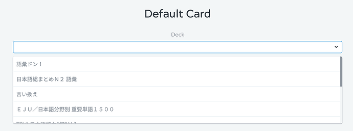
I wish there was a way to reorder decks in the dropdown list when creating new cards through the dictionary.
I think I can understand from the perspective of database design why this defaults the way it does, but new decks are placed at the bottom of the list by default, and generally when I create a new deck it’s because I want to add a lot of new cards to it. Whereas the older the deck, the less likely I am to add new cards to it. >.<
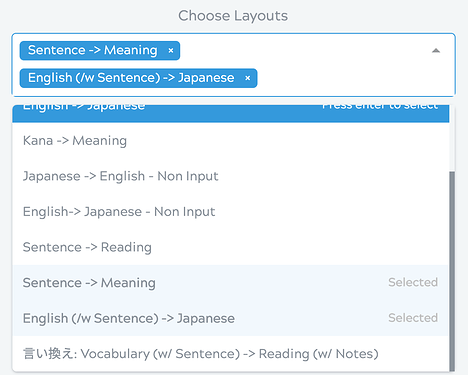
(If this functionality was implemented, I’d be happy to have the option to reorder card layouts in that dropdown menu as well!)
I think what you’re saying about the sorting makes sense. It’s usually the same for me now that I think about it. I’d like to hear from others what they think, if it’s the same for most of us, I don’t mind changing the sorting 
It’s generally true that I tend to add cards to the most recent created decks, for sure.
I want lesson stats!!! (for the record, there should be at least 13 exclamation marks here but I’m being censored by big forum)
ps: お願い ;(
Hahah  What kind of stats would you like to see?
How many lessons I did in a given day and on what days I did lessons (I’m sure there are other interesting ones but this is all I can think of as truly useful).
Also some way of regulating lessons based on review accuracy (forbidding lessons for a particular deck if you get too many reviews wrong).
As for features, I’d also like to be able to choose whether or not a deck’s lessons stack (off by default naturally).
A lessons (and separate for reviews as well) heatmap is planned for the statistics page so that’d be covered  Alongside that I’ll probably be adding achievements while at it
  (like “100 lessons done” etc).
Would there be any way to filter these stats? Something I’ve been thinking about doing is expanding my Kitsun stuff outside language - like adding a set for note listening practice, for example - and being able to see that kind of thing for say, individual sets or subjects, would be cool.
Dark Reader doesn’t work on this website!
The community website is eye-piercingly white which would normally be a problem since my trusty Dark Reader extension takes care of it but somehow the website seems to evade it. I haven’t seen Dark Reader fail anywhere else.
You can select a dark theme for the forums in your settings. That should help a bit!
Missed this reply somehow, sorry. It would be viewable per deck and as a whole 
I’m dumb, I missed it completely. Thanks.


