The Minor Annoyances Thread

21

This doesn’t happen all the time, but sometimes when there’s more than one kana and/or kanji it puts a space between some of the characters on the screen. Once I fill in my answer and press ‘enter’, it goes back to normal.

Not important at all, but I noticed it yesterday and now I can’t unsee it. :expressionless:

1 Like

Did it only start happening since this week by any chance?

I think I noticed it like 2 days ago, so I don’t think it’s been there for a very long time.

1 Like

For the synonyms, do the same rules apply for ignoring parts in parentheses? I thought I had a good idea to put (to) verb there to accept both short and long forms, but it fails when omitting the to.

1 Like

I recently altered a bit of that code and also saw that this was not the case for synonyms, I’ll fix it so it works the same :slight_smile:

1 Like

39

I’m making my own deck, and it’s JP - > Dutch, but the ë seems out of place. I don’t know how it’ll react to ï and ü but I suppose it’ll be the same.

2 Likes

Looks like the font family does not support special characters. You are using a copy of hinekidori’s layouts right? I know that they specified a different font for those layouts. You can check if it helps to disable the specified font rules (in the css of the template).

If you don’t know how to change it, I’ll gladly help you with it :slight_smile:

En leuk overigens! Vlaams Nederlands?

2 Likes

Yes, I don’t know which one I’m using exactly because they all just say ‘10k voc Kitsun mod - Community deck’, but thanks, I’ll try to find out how to fix it!

Jup, ik woon in Brussel dus Vlaams Nederlands met een Frans accent :grinning:

1 Like

Is this from a specific deck?

It’s the Genki complete vocabulary deck

Ah okay, it is a formatting thing then, left over from when I had this deck in Anki. If you can let me know in feedback when you come across it I will fix it.

:+1:

3 Likes

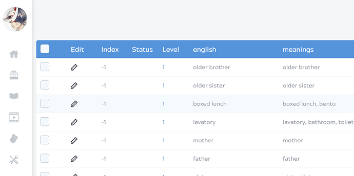
The hamburger menu has a nice color theme highlight when your mouse scrolls over, it looks great. However in card management editing, the highlight is barely distinguishable when you need to see the entire row. Any chance this could be more obvious?

It would be great to have a card count total for each deck somewhere in the layout too. If it’s somewhere already, I don’t know where it is. If you make a lot of cards at once, it’s easy to miss one or lose count. Plus I have some decks that will grow in time, I’d like to keep track of these number if possible.

2 Likes

Which theme do you use? And do you mean the actual highlighting of the row?


like above?

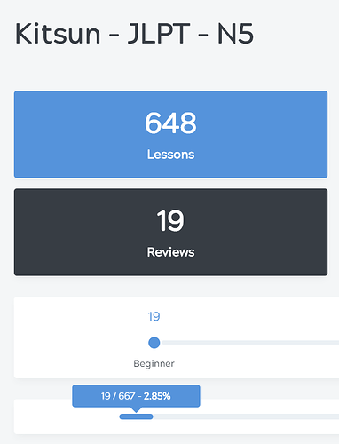
Agreed! There is a hidden count in the progress bar of the deck when you hover over a rank that you could use as a temporary workaround. It does exclude filtered and hibernated cards though.

1 Like

I use Dark Theme Red

Yes, exactly! The light blue shade looks more noticeable with ‘Light Theme’ but ‘Dark Theme’ is my favorite for everything else.

Can’t believe I’ve never noticed this before, it looks great! Well, if you decide to put a permanent total card count indicator, my vote would be on the ‘All Your Decks’ screen and/or the manage deck screen like you have above.

1 Like

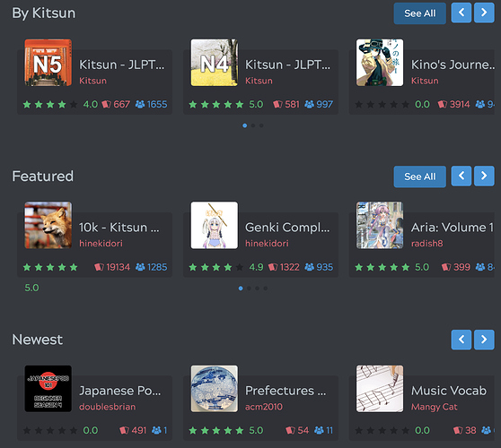
In the “All your decks” page I really liked the huge boxes with the mouseover zoom effect, why are they so small and puny now? The deck names are often too long now as well.

Once you got quite some decks it became difficult to get a good overview due to the decks being so large. Now a lot more decks fit on your screen :slight_smile:

What do you mean by deck names being too long? Could you share a screenshot of the issue?

I was actually remembering the shop page:

And I only have a few decks :slight_smile:

On iOS, the question text still scrolls up when opening the keyboard so that only half is visible.

But now after the update it is not possible anymore to scroll back to see it, and the keyboard must be hidden to reach the “< Results” button …

With which layouts does this happen?

Well that’s definitely not intended, does it not scroll at all?

I looked at 4.5K and 10K, no scrolling at all. On the JLPT decks there is enough space at the bottom, so everything looks fine. I think there was an iOS update recently, maybe they broke the scrolling again.