The changelog reaction thread

I know, but it’s not the same :wink:

That seems like a good idea - you could just add an [implemented] or [fixed] tag to the title or something. That way people still have the opportunity to discuss if they want, like if it turns out not to be quite what they expected or introduces or a new bug or something.

4 Likes

Or add your own post as the solution of the thread itself, like a true man in power. @Neicudi

3 Likes

This has been an awesome feature. While I’m reading/watching stuff, if I get exposed to a word I have yet to learn but that it seems interesting to do so, I always check to see if they’re on Core 10k. If they are, I just add them to the lessons pile so I can learn them in the following day! \o/ Lessons have been tremendously easier now :heart_eyes:

2 Likes

Other languages would be nice too, indeed! If you need some recommendations, I used wordreference.com for English<->French. I never noticed a specific problem with it. (That being said, I stopped using it as soon as I was advanced enough to use monolingual dictionaries).

Speaking of which, Jisho is nice and all, but what about goo (dictionary.goo.ne.jp/jn/) or the like? I’ve been trying for a while to make cards from goo, but I just don’t have time to finalize my deck.
Maybe one day I will have a sharable J-J deck :sob: But not today.

3 Likes

Any online dictionary that has a public API will be fun for me to add, so if you know any let me know!

Right now I’m especially looking for Korean and Chinese dictionaries.

Looks sick :ok_hand:

Almost there :grin:

Good choice.

I was having a hard time figuring out how you were going to make this process smooth, but damn! Gj :grin: Can’t wait to binge on the advanced one though :eyes:

1 Like

Lesson/Review bottom buttons should now always be visible without having to scroll the page down.

I found a small regression with this, on my phone Chrome mobile likes to needlessly show the address bar in an unhidable way, which seems to shift the button out of screen, but I can’t even scroll to them, so I’m stuck occasionally :slight_smile:

1 Like

Oh snap, It should always be at the bottom of 100% (AKA the inner height excluding the address bar). But I guess this isnt always the case then… What phone model/OS are you using?

It’s a Huawei phone, Android 8.0.0, Chrome 70.0. I blame chrome, Google loves wasted screen space.

1 Like

I also use chrome on my android phone but dont have this problem :o. Maybe the card content is pushing out the buttons?

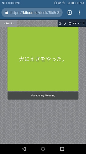
It looks like this for the 10k deck:

No scrolling or zooming possible. Maybe the buttons end up under the Android soft buttons.

Edit: searching for “Show” finds something at the end of the page, but doesn’t show it either.

Pretty sure I found the problem. Will do a hotfix for it tonight. Sorry for the inconvenience!

Just to confirm, you can still see the ignore button on the backside?

1 Like

Can’t check on all pages, but ignore is visible :slight_smile:

1 Like

Okay good. Fix incoming tonight then ^^

1 Like

Hotfixed it, sorry for the wait! I’ve also contacted hinekidori about if he can update the layouts to utilize 100% instead of 100vh (so that the buttons dont overlap with the content :slight_smile: )

3 Likes

Since there hasnt been an update in about two weeks, I figured I’d use this thread to give a bit of an update:

I just finished completing the reimport feature (that allows you to mass edit cards in google sheets/excel/whatever and reimport the changed data into existing cards) but I don’t have enough time to actually go through with the update today.

It’s going to be a big one! Look forward to this and more:

  • export feature
  • reimport feature (as described above)
  • new (much better looking) default template and layouts
  • auto hibernating words that you already learned in other decks (for cards using the new default templates)
  • dictionary (jisho) default template/layouts changed to the new ones
  • Creating instant dictionary (jisho) cards with your own templates and layouts.
  • Whole bunch of new decks that I’ve been working on!
1 Like

The speedup is great! Feels much more snappy now!

2 Likes

I’m glad that the general reception has been very positive so far, I’ll probably change lessons next :slight_smile:

Continuing the discussion from Kitsun Patch Notes:

Could the new leech table perhaps be positioned underneath the navigation buttons? I use those a lot, whereas I’m unlikely to be looking at my leeches every five minutes, so it’s kind of annoying having to scroll past them each time… Though perhaps it will make them less leechy… Maybe I should just accept this…

1 Like

I’d kinda prefer them to stay with the rest of the items. How is it when it’s minimized? Still annoying? I didn’t have time to make it save the state in the cookies, but that’s coming with the next update.

Probably making everything minimizable while at it ^^

Let me know what you think, I can still put them down there if the above isn’t good enough

1 Like