A few minor improvements which I think would help greatly when using the site!
-
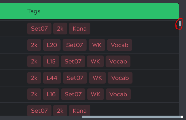
Prevent up/down scroll bar disappearing on the right.
Currently when in ‘manage cards’ for a deck, I can only use the up/down scroll bar when scrolled all the way to the right. It disappears when I move back left. This makes it a pain when needing to jump quickly (such as getting to the halfway point of the deck).
 (Disappears when scrolling to the left)
 -
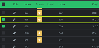
Allow selection of the item anywhere along its line
(Example of whole item being selected)
Currently I can only select an item (check its box) when scrolled all the way to the left. I feel like it would make sense if we are able to select an item no matter where we are currently scrolled. Another way to do this would be to freeze the leftmost checkbox so it would stay with you while you see the item’s tags for example. Otherwise you have to scroll back and forth across the page to see an item’s tags and select it.
-
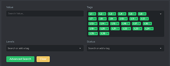
Allow easier mass search of tags
(the pain!)
Currently, I have to search each tag or type it in and select it in order to accumulate multiple tags. Not bad for one or two but a pain when selecting 26 levels of wanikani… A better way would be to have a dropdown box that allows you to check a box for each tag you want to include.


