Version 1.0.2 (3)
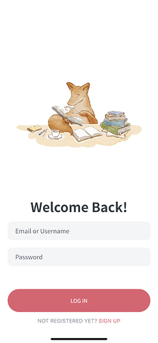
- Login
Would be nice if the keyboard auto focus when I open this screen
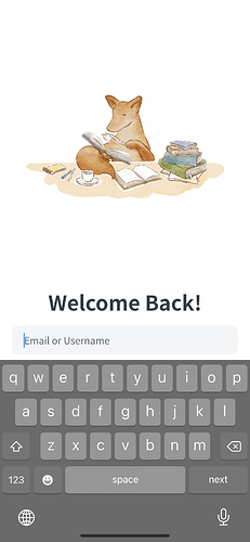
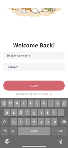
- When the keyboard does open, it only shows the username/email field, like this
It’d be nicer if it could scroll to show the whole form so it doesn’t need to scroll between fields. Will feel a bit nicer to use.
-
I find the foldout animation of the decks page is distracting, especially when I go in and out of decks (sorry!). If you want to keep it, my vote would be to only show it first time, and not when going back from a deck.
-
I know it’s only a theme preference but I find the default light-red theme quite harsh. Blue seems a lot softer.
-
It would be nice if it could have defaulted to a dark theme since my system is set to dark mode.
-
Dictionaries. YES I LOVE THIS. This will save me so much time from opening Chrome etc. - I’m really missing the custom card option though since I always use that. BTW I don’t really need the card preview in that flow, just the ability to select my layout and have it remember the field mappings. It’d be amazing if it could remember what layouts I selected per deck since some decks I use recall, some I use reading+meaning.
-
It would be really useful if the decks page was ordered by reviews, then lessons (or have an option for it), so I can easily see decks which need my attention at the top. I know you have the bit on the home screen but that’s too far down and only shows 3 decks.
-
I feel like the reviews and lesson count needs to be bigger so I can see at a glance. It’s too small at the moment.
-
I’d like to be able to quickly enter reviews/lessons fron the “all decks” rather than having to tap into a deck in order to do that. I have a lot of different decks so it’s a lot of wasted taps.
-
IMO adding a new deck isn’t a regular enough action that having it at the bottom right of the screen always visible, feels a bit unnecessary. It doesn’t specifically get in the way of any content, but it feels distracting.
-
The app says my stream is 18 days but the website says 580
-
I’d love it if the upcoming reviews could stretch to 48 hours. Plus this is a view I look at A LOT, so it’d be really nice if it was higher up on the home screen so I don’t have to scroll down. Ideally I don’t want to have to scroll at all to find it. IMO it’s more important info that stream and progress.
I almost feel like there could be argument for progress and streak going on the profile page.
-
FWIW I’m not that fussed about the achievements in Kitsun. Not trying to say it’s not a good feature, just that I don’t value it

-
Settings is a bit hidden down the bottom of profile. I wonder if a cog button top right might make it more visible/easier to access? Especially on devices with a short aspect ratio, people won’t see the Your settings on first open of the profile. Will get worse if you add more stuff to profile too I guess.

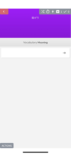

 I agree it would be nice to have though!
 I’m hoping it can give some extra motivation to those that do like it


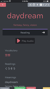


 I’ll put your audio suggestion on the todo list, as that definitely sounds like it’d be a nice feature!
 My bad for not reading what I worte before posting it.