
- It looks awesome.
- In DECKS, the majority of users are likely to be consumers, not creators, so the order at the top should probably be All, Community, Personal, Published (at the very least, Published should be last as it seems the least likely to be used).
- In DECKS, the deck image and space between the decks is too large. I only see 4.5 decks in the list without scrolling. If this is not something you feel should be changed, offer a tiled view (grid layout) as an option.
- In COMMUNITY, perhaps offer a way to jump to a category from the top of the page (an expandable jumplist?). The less scrolling required on mobile, the better.
- Notifications, please!
- Also need a way to jump into reviews from HOME. I suspect this is not specific to the apps though and is more of a Kitsun thing in general.
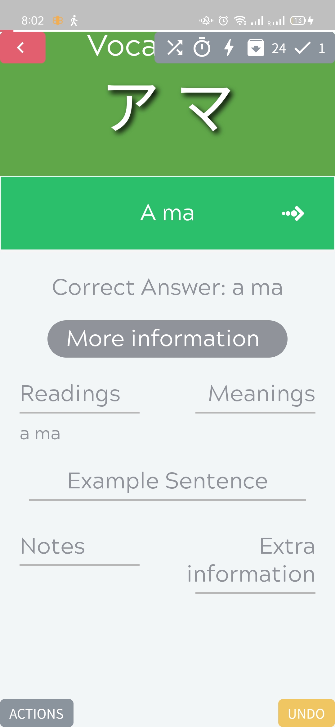
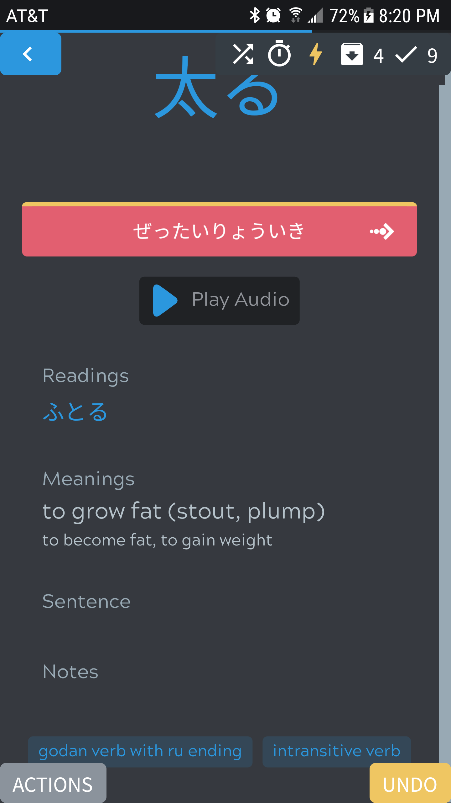
- In individual decks, the DECK SETTINGS button occurpies a whole line. This unnecessarily pushes the other sections down. Perhaps consider shortening it to SETTINGS (we’re in the deck, so it’s expected that the Settings button is for the deck after all) and maybe put it on the line above it, next to the Lessons and Reviews counts?
- In individual decks, I would recommend putting the timeline above the Your Progress section and allowing for a wider window of visibility (I believe this was suggested for the iOS app also).
- In individual decks,The buttons for Lessons and Reviews could maybe be called just that? They feel wordy for buttons.
- In the DECK SETTINGS, maybe hide options that cannot be changed? For certain decks for instance, the cards can only be ordered one way and the option is anyway greyed out, so maybe don’t even show that? Same for Delay Siblings if there are no siblings, for example.
- Layout Filtering seems to be unavailable.
- When Reviewing, the keyboard gets dismissed when you hit enter and then you have to click the arrow to move to the next card. Please bind the enter key and keep the keyboard active. The current bahavior makes it annoying as you have to keep tapping to invoke it over and over.
- When Reviewing, the menu summoned when you click on ACTIONS seems to have a UI that I believe is iOS-like. Anyway, it doesn’t seem very Android-like. is this by design or am I just mistaken?
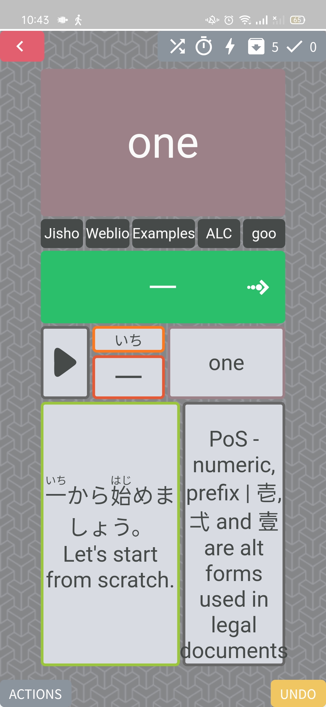
- When Reviewing, the grey bar in the top-right (shows the review session details) is covering part of the card. Can the card be shifted down and maybe the background of the card simply extended upward to fill the resulting empty space above?
- The general UI when Reviewing and More information button and text that appears when you click on it seem huge.
- The Kitsun blue logo on the web tab would work much better as an app icon than the current one
 .
. - Might I suggest moving all the Settings that are in PROFILE to a cog button next to the Your Profile title? Would make for a cleaner page that doesn’t require scrolling to get to Settings. Especially if achievements/badges are coming in, it’s probably best if settings don’t keep getting pushed ever lower…
- Could the ACTIONS and UNDO buttons when Reviewing be a bit bigger? In my case, I have a round-edged screen so those buttons get shaved off in the corners. And as I make a lot of typos, I overuse the UNDO button, which is difficult when it’s this small…
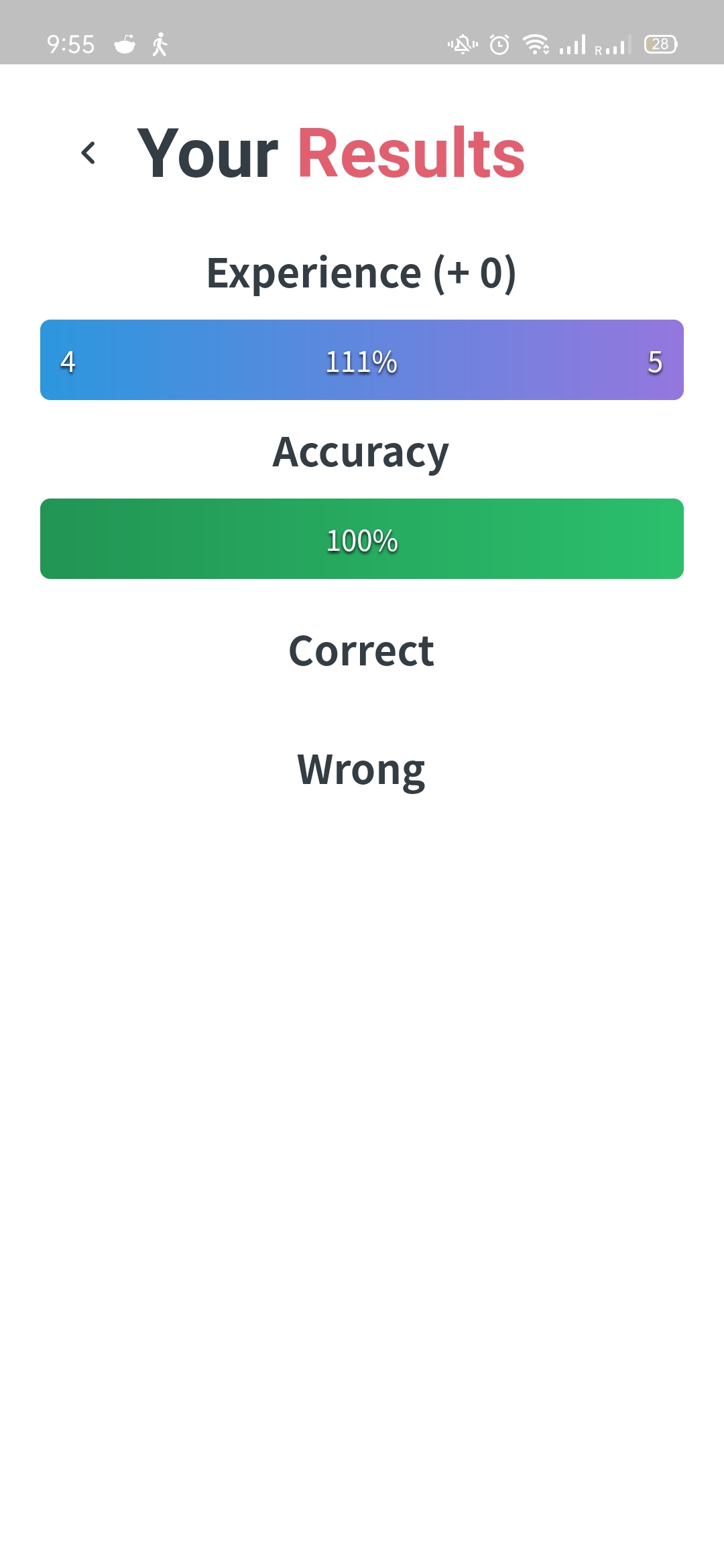
- Uhmm… What’s going on here? FYI: I kept my review session open for over an hour on purpose to see what would happen…
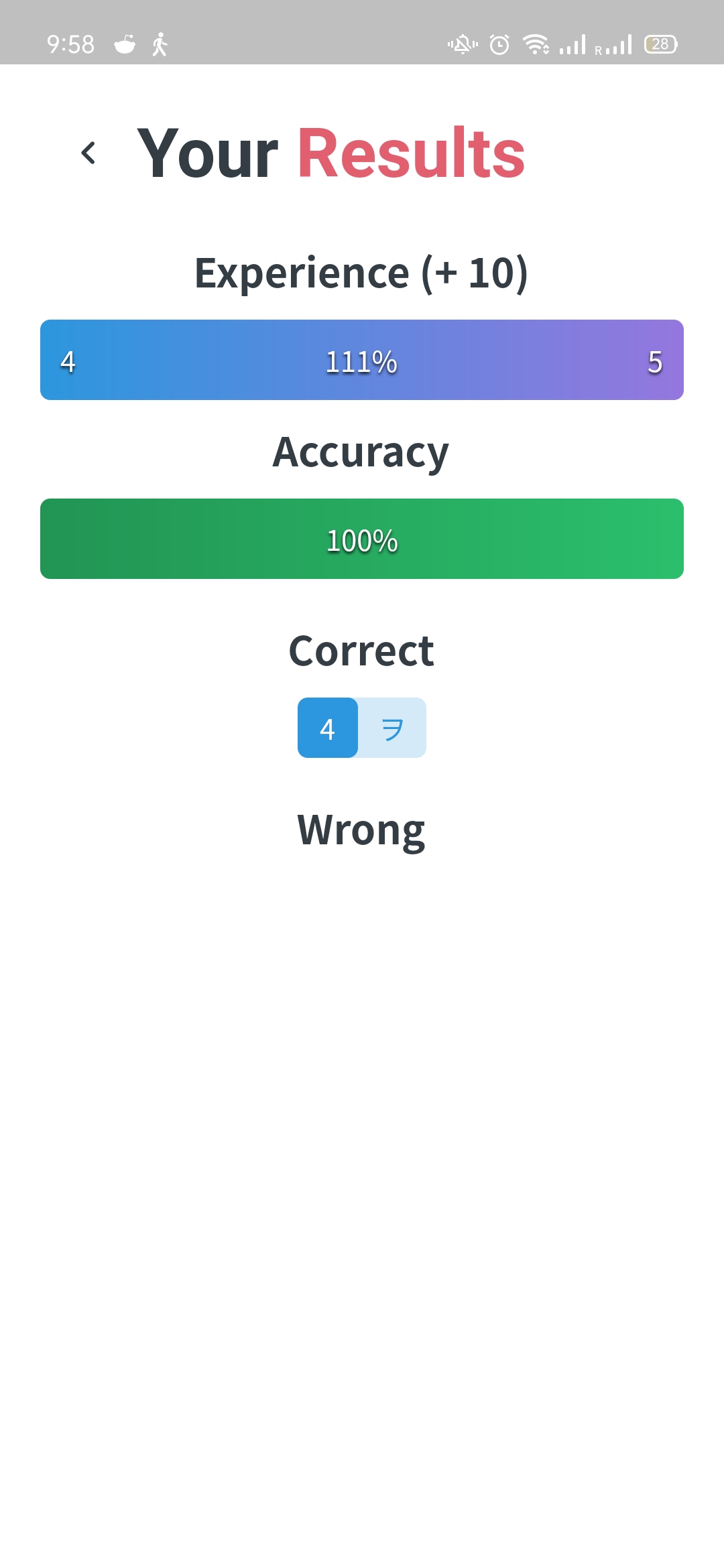
EDIT: it made me redo the same review again and this is the screen I got
Apart from that weirdness, why is it not leveling me up?
- It would be helpful to provide the more detailed SRS breakdowns (4 levels in category 1 and 2 levels in category 2). Maybe when we click on the relevant SRS category, or as a setting for those of us who like to know exactly where in the SRS our cards are.
- I don’t know if this is by design but typing “cat” or “ねこ” in Jisho - Kanji returns no results. Only the typing the Kanji works. In Jisho - Vocabulary, all three work. This is likely not specific to the app.
- There’s a very attractive dude staring at me in the PROFILE section. I like that. Keep it.
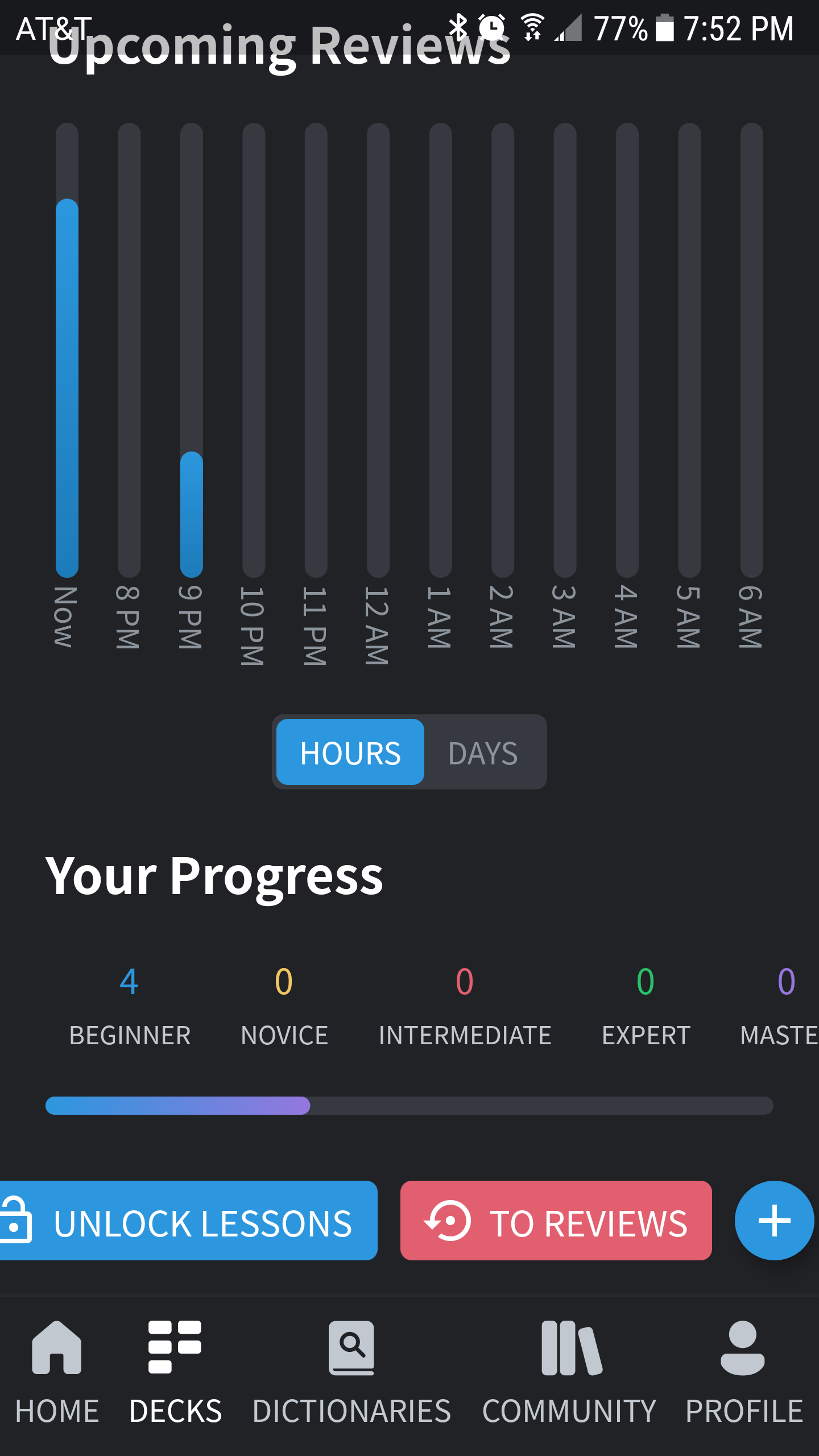
- As you are gamifying, it would be a good idea to display level and level progress on the HOME page. For those of us interested in leveling up, having it visible is motivating.
-
the app sucks monkey ballsno, it doesn’t. @jprspereira made me say it did.
2 Likes
I finally found a reason to upgrade my phone… when I can justify that expense…
So while I can’t give feedback on the app (and really, I’m not much a mobile guy so no loss there) I will say that image on the store page is cute af, hella adorable, criminally charming.
4 Likes
You already did right here:

New phone recommendation
Might I suggest an Oppo Reno? Performance has been excellent (I’m a techie, so I tend to be picky about that), price is great, and I’ve had it for almost two years now with no issues whatsoever.
1
Thanks! 
Right now it has the same order as on web, I think it would make sense to change both orders in that case.
I don’t feel like I can change it much as there is limited horizontal space on phones. For tablets I am working on having at least two columns for the decks.
Hmm, I’ll have to check if there’s a good spot to put it
Coming soon!
You can use the “start reviewing” decks at the bottom to quickly go to your decks with the most reviews available.
This works for some phones but not all of them I think. I do have plans to remove the button and add it to the floating buttons (as just the cogwheel icon) above the (+) button
Yep! Got that one noted!
These buttons too will probably get changed/removed. It feels a bit messy at the moment so I’m trying to come up with new spots for them 
I do wish to show greyed out options as they can prevent deck authors from getting a lot of the same questions (like how is the sorting order for this deck?)
Yep, it’s on the to-do list
Enter should definitely make it go to the next card, so that’s definitely a bug (or it’s already doing the call in the background)
By design, it’s not exactly like an iOS menu either.
I believe this is an issue with the old(est) default layouts not keeping in mind the UI. I think it behaves the same way on mobile web? Those layouts are deprecated due to reasons like this. Sadly I can’t add padding to layouts automatically as it would result in a white or dark (depending on the theme) banner around the content…
Also noticed the font-sizes being bigger than they should be on phones, it’s on my buglist!
I don’t like the currently (blue/dark) logo as an app icon, but we’re internally working on rebranding
There’s multiple categories incoming on that page, the initial design had a row per settings category but right now there’s only 1 real setting, which makes it look a bit off. This will change as we add more settings.
Big buttons setting is on the to-do list!
I’m not sure 
Yep! Agreed
The kanji dictionary only works by entering Kanji. This is a limitation of the jisho.org api that’s being used.
haha :’)
Agreed! I plan on adding a stats page as well for a more detailed breakdown of your studying

That was a lot of feedback! Thanks a bunch!
3 Likes
I’m aware of this problem! Going to try to lower the minimum android version so I’d wait with that upgrade just a little bit longer!
4 Likes
2.
Agreed. Probably best to have them both changed.
3.
How about making the deck image size smaller so we can have more of the list on the screen?
6.
Yes, but I mean a way to jump straight into reviews, maybe with options when the session starts so users can say how they want the cards ordered (FIFO, SRS level, specific deck order…).
A floating button does sound nicer, yes. But I don’t understand which + button. There is no such button on an individual deck page  .
.
Yes, they are messy right now .
This makes sense!
The keyboard is dismissed, card marked correct, card doesn’t advance.
Yeah I guess what I’m suggesting is moving the entire settings section behind a cog and then having the categories in there also. Settings are not something users usually change all the time, so storing them away in their own little section will free up the Profile page to be just that, a profile page, and keep the focus on whatever is relevant to the Profile. Currently it feels like two separate screens are put one on top of the other. Check out the Lingodeer ME tab (they out the settings button on the ME page and in the settongs they have separate categories). And if your Settings are more numerous and require categories that you click into, it would probably be worth the extra click to drill in further in exchange for stowing them in their own dedicated section.
Yay, stats!
Err… So I reviewed a card and now it’s stuck on this screen.
The arrow is not responding.
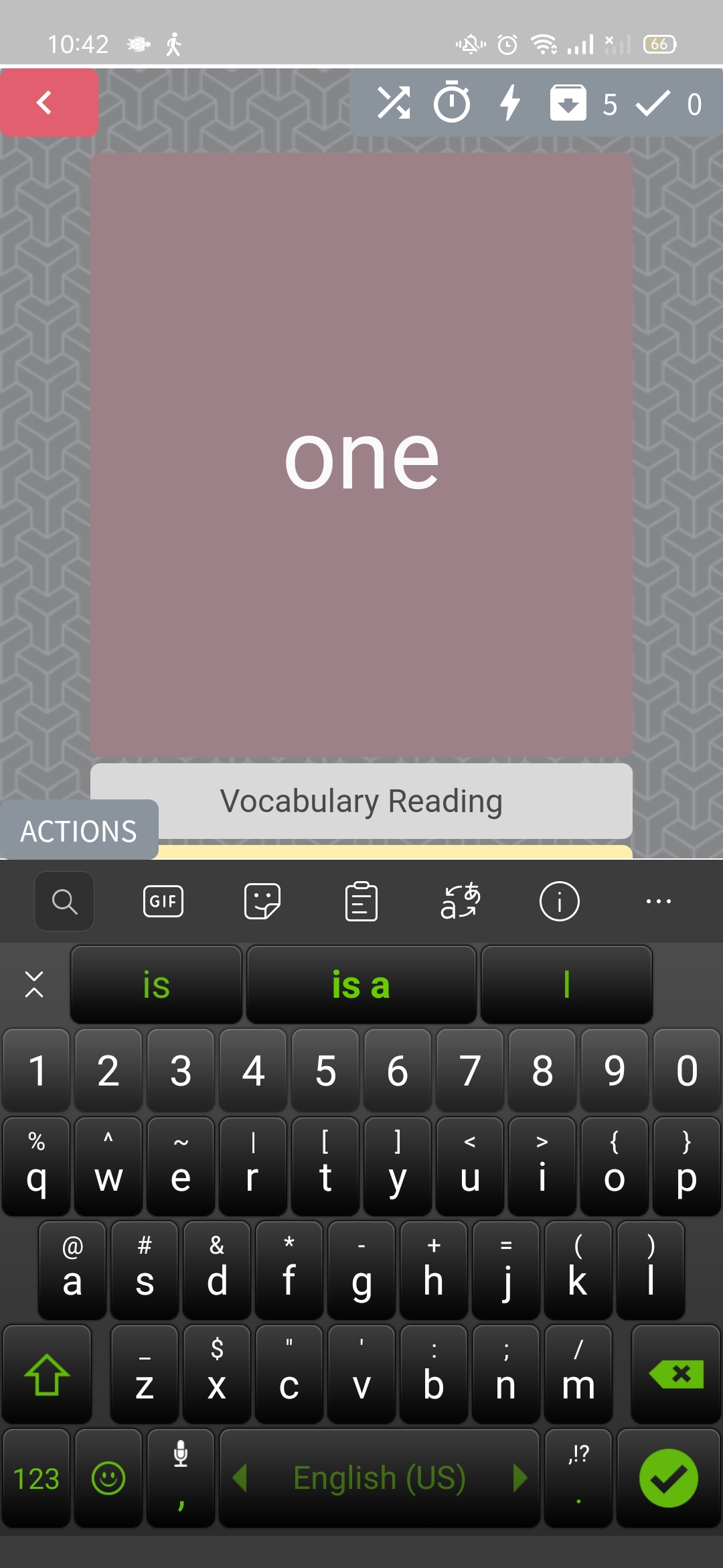
More layout problems. Hard to type when you can’t see the input bar…
The keyboard is automatically invoked with first letter in uppercase. This leads to the first reading character being in Katakana. Please disable Auto-cap :).

1 Like
Unless they have some budget models hidden away that looks like too much for me (and my wallet). Maybe if I get another job with a boring public transit commute, but like right now I only use my handmedown phone as an ipod/ereader + 911.
Besides, why buy a new phone when I could put that money towards my next Kitsun payment? 

3 Likes
Unfortunately, I can’t think of a single phone I’d actively recommend under the Oppo price range.
Having said that, TCL 10L costs 150 bucks or so today (Prime Day) and is very highly rated on Amazon. So, if you’re actually interested in a new phone, could be worth looking at  .
.
2 Likes
The minimum Android version has been decreased with the latest version just released.
2 Likes
Yes! I’ll post the update notes in a bit
3 Likes
Perhaps along with a response to the feedback provided above too 
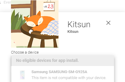
@ccookf Install!!
P. S. I had to login again to get back into the app. Is this a configuration issue that doesn’t persist a login between app updates?
3 Likes
Haha, thanks! Did you also have your password set to a long stream of random letters, numbers, and symbols that kills your soul when manually inputting it to a mobile device?
I’ve used this for all of two seconds, but here’s some quick thoughts:
- I had to remove a useless shortcut on my homescreen to make room for an adorable fox that is 98.37% likely to distract me during the day. Management is concerned that the duration of employee bathroom breaks will increase by 254%
- Decks will have an “unlock lessons” button despite having done all of the lessons for the day. Edit: Doing this causes the home screen to list lessons as available despite all active decks having 0 lessons listed. This persists when switching back to the web app.
- The progress bar for a deck doesn’t have those pretty bars showing how many are begginer/novice/intermediate/expert/master.
- I forgot that it was convenient having a mobile dictionary instead of tabbing to jisho all the time, woohoo!
- For custom decks the unlock lessons, review, and new card buttons will cause the elements to overflow and clip on my device.
- When doing the last item in a review it seems to require clicking enter/forward twice to actually sync and go to the results screen #minorannoyances
- The default layout looks nice on mobile, but when showing information the actions/undo buttons will clip over the tags a bit when scrolled down.
- It’s clearly WIP, but I found it a bit weird that logout was buried under Profile -> General Settings.
- I am a filthy achievement chaser in games, please don’t do this me :’(
2 Likes
Yes, it’s a crazy password, and no, it doesn’t drive me mad, because I use a password manager .
Which keyboard do you use?
The “unlock lessons” even though there are no lessons to unlock thing has existed on the webapp for a while now.
You get what you deserve you filthy redacted- achievement chaser!
Like phone keyboard? I just use the standard one. I had tried a few in the past, but nothing really clicked with me and the Japanese input was easy on the standard one. Maybe I should have considered a password manager that does the cloud/sync stuff, but the idea doesn’t sit well well with me.
TIL, thanks! Now I can use unlimited lessons without having to acknowledge I’m setting myself up for failure… Seriously, though. I’ve been doing it by toggling unlimited ><
3 Likes
In just occurred to me that even the word SETTINGS is too verbose. Apps seem to use the settings cog on its own without people getting confused. It would probably look nice and clean without any background either.
When doing a dictionary search that returns 0 results the app just shows a blank results screen instead of indicating that a search has returned nothing.
野津町, The Cursed Town of No Result
I think I’d prefer the way it looks right now. I’ve tried that before but it felt off to me.
Someone suggested making the counts on the decks clickable in order to jump right into reviews/lessons. I’m afraid it might be a bit too difficult to tap correctly on the deck itself or one of the lesson/review counts but will check first
Personal decks have a + button to let you add cards, community decks don’t as you can’t add your own cards there.
This should be fixed with the latest update 
This issue is difficult to be honest. It depends on the layout design too (the top portion is taking a lot of unneeded space there). The card can scroll and put the input in the middle, but with autofocus it would probably cut out a portion of the question of the card (e.g. “one” would be cut out of view). Causing you to have to scroll all the time. Another option is to resize the whole card when the keyboard comes up, but that would lead to a lot of sizing issues (the available space is now ~50% so it becomes very cramped).
The latest update should’ve made the card scaling a lot better on android though, perhaps that already helps?
This is an issue with SwiftKey specifically. They do not respect the HTML standard that tells keyboards to not capitalize the first letter. The Japanese input in kitsun changes to either katakana or hiragana based on whether you type uppercase or lowercase.
A bug report for this has been open at SwiftKey for a while now but they do not seem interested in changing it (now that Microsoft took over I have even more doubts that they will change it )
I believe it currently expires after 7 days of inactivity (like the website)

As mentioned by others, this is expected behavior for when you want to do more lessons than your daily limit
Might add those to show on tap!
I’ll be changing these buttons, even more so now that it’s causing issues haha
I’ve heard this from a few users now but have not been able to reproduce it yet. I’ll keep trying!
Yeah I think the fix in this case would be to add more padding to the bottom of the layouts, as doing it globally or in the app itself will lead to black/white bars.
Yep, WIP!
hahaha
Hmm, it should’ve shown something there I think. Putting it on the list!
Thanks both for the feedback! Appreciate it! 
This is a dumb question, but whenever I do reviews I have to turn on lightning mode back on. I vaguely recall seeing a settings screen that covered some of the preferences when I installed the app, but can’t find it again. Where was it?
1 Like
There’s a reorder popup when you click on the icon (next to the lightning mode/wrap-up icons), which might be what you’re thinking of?
I forgot to persist the lightning mode setting between sessions. Putting it on the list!
1 Like