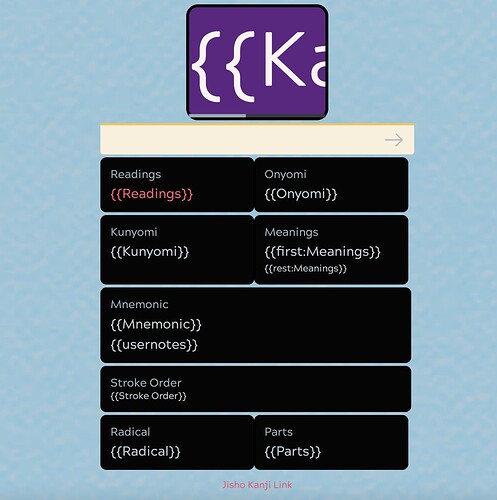
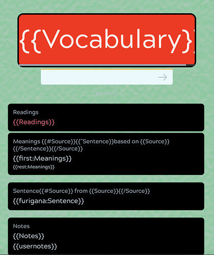
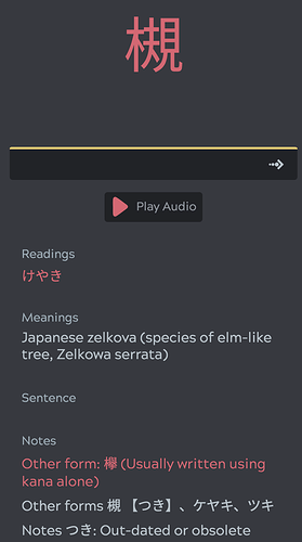
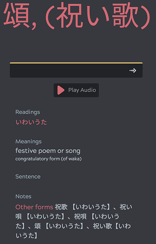
The font size should be the giveaway, the kanji is always bigger. I never had issue distinguishing between the two, don’t know how others feel though. But is sort of redundant to study both as readings/meanings are usually identical, I only added them so users can recognize they are part of a vocab item (otherwise feel free to hibernate)
As for the card styling, could potentially change the styling color to something different to distinguish, not sure if possible.
It’s some thing in here but what to change to, I’m not sure but looks like locked into output format (read/meaning/japanese) (I’m sure someone here could recommend w/ CSS skills).
    <div class="prompt_color">
    </div>
  {{type-ja:All Readings[Reading]}}
  </div>
</div>
Yeah, I pretty much despise this color scheme, lol…will not go back to WK (nor do I have template for it). But I know what you mean, so perhaps something more subtle like above or just users recognizing the font difference (or hibernate repetitive content all together). A template update would also be global, so you may like but others may not…can’t please everyone. Also don’t know the consequence on converting to another template on a community deck. I’ve noticed the custom highlighting that I put in for the radicals don’t work well on other templates at all…that would be painful to fix or they would just have to get erased all together.
Perhaps it’s on Kitsun’s to do list, but a criticism has been that users want to custom modify community decks however they want and that isn’t possible (yet). So if that is on the to do list on future update, then that would afford the opportunity for anyone to customize however preferred per user on community decks.


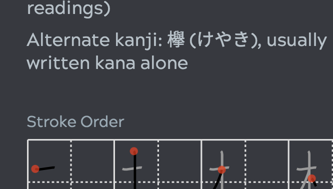
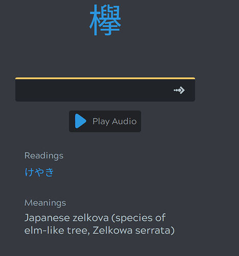

 .
.

