The changelog reaction thread

Thanks! The styling works, I will try the other new styling option tomorrow.

It seems that the click cards are based on the know/don’t know cards, is there a reason for this? With the current setting you have to still say yes/no when you click the wrong thing, and there is no way to see the backside with the default lightning mode.

I think there should be a new card/input type that works similar to the type input one, that goes to a red/green styled backside based on the click, and lightning mode should skip the backside if you set that option only.

Another thing, maybe it’s only for convenience. I have groups of prefectures that should be clicked, and I tried to put the group id into the {{click:fieldname}} field, but it doesn’t work, I probably have to enumerate the prefectures at the moment. Is there some way to check if an enclosing element is a correct click? [I could imagine that for certain SVGs this might turn out to be a real problem because the things you click are some elaborate drawing inside a group instead.]

There are only two types of cards at the moment. Cards with input and cards without. My reasoning was that you would want a correct click to automatically advance to the next card (I believe you asked for this before? :open_mouth:) whereas with a wrong click, you first want to see the backside to check what is considered correct (since you answered wrongly).

From what I gather you want to have the backside display on both getting an item wrong AND correct, and then only have a ‘next’ button instead of the ‘know/dont know’ buttons? I can see how that would be nicer.

hmm, that really depends on how the html (or svg in this instance) is styled and stuff. It’s a bit tricky to do a lookup with javascript since there could be an X amount of parents that it would have to loop through.

1 Like

My bad, I was probably writing in a strange way :fearful: I meant that you can advance to the next card without saying yes/no again, just looking at the backside/pressing space to continue. It is a card with input after all :slight_smile:

I was imagining a bar similar to the input bar that says “Click X …” (but you can only look at it, not type), and on the backside you get a red/green bar and a next button. So acting like the type input, but you replace text input + enter with a click. Basically as you say :slight_smile:

I will experiment a bit, I forgot to add kitsun-click to the outer class, maybe it is going something sensible already. But for the SVG you probably only have to look at outer <g> elements. I check if there is some easy criterion.

1 Like

Ahh definitely looking forward to a dark theme!! My eyes will be very thankful haha

1 Like

Ah I see, makes sense. I’ll put it back on the list ^^

I’ve added a general roadmap for the near future in the changelog thread:

Please let me know if you think I forgot anything important :slight_smile:

2 Likes

But @Neicudi, if you close the topic straight away, how are we supposed to shower you with gratitude?!

You can still leave likes or post here :wink:

It’s more so I have a personal overview of what’s done and what isn’t ^^

Maybe it’s better to use some kinda tag system instead, that way you would still be able to discuss the changes specific to that request/bug?

1 Like

I know, but it’s not the same :wink:

That seems like a good idea - you could just add an [implemented] or [fixed] tag to the title or something. That way people still have the opportunity to discuss if they want, like if it turns out not to be quite what they expected or introduces or a new bug or something.

4 Likes

Or add your own post as the solution of the thread itself, like a true man in power. @Neicudi

3 Likes

This has been an awesome feature. While I’m reading/watching stuff, if I get exposed to a word I have yet to learn but that it seems interesting to do so, I always check to see if they’re on Core 10k. If they are, I just add them to the lessons pile so I can learn them in the following day! \o/ Lessons have been tremendously easier now :heart_eyes:

2 Likes

Other languages would be nice too, indeed! If you need some recommendations, I used wordreference.com for English<->French. I never noticed a specific problem with it. (That being said, I stopped using it as soon as I was advanced enough to use monolingual dictionaries).

Speaking of which, Jisho is nice and all, but what about goo (dictionary.goo.ne.jp/jn/) or the like? I’ve been trying for a while to make cards from goo, but I just don’t have time to finalize my deck.
Maybe one day I will have a sharable J-J deck :sob: But not today.

3 Likes

Any online dictionary that has a public API will be fun for me to add, so if you know any let me know!

Right now I’m especially looking for Korean and Chinese dictionaries.

Looks sick :ok_hand:

Almost there :grin:

Good choice.

I was having a hard time figuring out how you were going to make this process smooth, but damn! Gj :grin: Can’t wait to binge on the advanced one though :eyes:

1 Like

Lesson/Review bottom buttons should now always be visible without having to scroll the page down.

I found a small regression with this, on my phone Chrome mobile likes to needlessly show the address bar in an unhidable way, which seems to shift the button out of screen, but I can’t even scroll to them, so I’m stuck occasionally :slight_smile:

1 Like

Oh snap, It should always be at the bottom of 100% (AKA the inner height excluding the address bar). But I guess this isnt always the case then… What phone model/OS are you using?

It’s a Huawei phone, Android 8.0.0, Chrome 70.0. I blame chrome, Google loves wasted screen space.

1 Like

I also use chrome on my android phone but dont have this problem :o. Maybe the card content is pushing out the buttons?

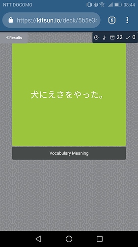
It looks like this for the 10k deck:

No scrolling or zooming possible. Maybe the buttons end up under the Android soft buttons.

Edit: searching for “Show” finds something at the end of the page, but doesn’t show it either.

Pretty sure I found the problem. Will do a hotfix for it tonight. Sorry for the inconvenience!

Just to confirm, you can still see the ignore button on the backside?

1 Like