Sometimes it would be very handy to be able to define divs or spans inside of field values to apply styles to only certain parts of said value. Whitelisting the div and span tags + the “class” attribute would help immensely.
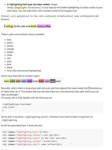
Sure, I don’t mind adding it  There’s also a highlight field type that might suit what you need, it will generate a div for every classname that you throw in there:
Let me know if you still want me to add them to the whitelist 
This is useful, but there are cases when I’d prefer the versatility of nesting things ^^
So if possible, I’d still like the divs and spans  .
.
Alright, no problem. Expect them to be added with the next update 
Just a random thought I had after fiddling around with the highlight feature: How about having shortcuts for empty divs or spans (either one is fine, can be formatted any which way anyway)?
Here’s the thought: Empty elements can be useful for displaying things like images within a field (by assigning a background to the class in the CSS). Then there are the scenarios where it’s useful to have more than one class on a given element.
So based on the highlight feature, my idea would work like this:
some text [:a b c][:a b c] some more text
Which would expand to something like
some text <div class="a b c" /><div class="a b c" /> some more text
While this wouldn’t be “valid html” (div tags can’t be self closing), I think I understand where you are going with this. As far as I know, the highlighting field is already able to add multiple classes (it should add whatever is between the brackets). That said, did you try something like:
some text [a b c] [x y z] some more text
combining this with the highlight feature should give the following (afaik  )
)
<div class='a b c'>some text</div><div class='x y z'> </div>some more text
Where x y z could be your empty classes (just a space as content) which you can give the background features that you’d like? a b c don’t have to be styled if you don’t want to.
Right, I’m too used to XML at this point 
I’ll try the thing with multiple classes in the highlight feature - hoping that the spaces won’t mess with formatting too much.

