Hi all,
I’ve been using Kitsun for a while now but after reviewing other tools out there I’ve finally decided to give this a good go. It’s the best in terms of flexibility and is the only thing I’ve found that supports my IRL lesson vocab in addition to WK.
I have a rather basic question in regards to HTML, please forgive me I’m rather new to all of this.
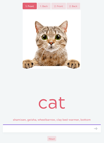
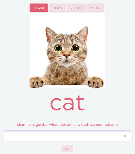
I’m creating a custom card layout which includes images. I’ve got the code in okay, but I want the text to be slightly closer to the picture, other wise the page often ends up too big.
Basically from this:
to this:
Here is the code from my card:
  <div class="full_wrap">
     <div class="main_wrap">
   <div class="nomarg"><img src="{{Image}}" style="width:50;max-width:400px;" /></div>
    <p class="nomarg">{{first:Meanings}}</p>
    <p class="subtitle">{{rest:Meanings}}</p>
  </div>
  <div class="input_wrapper">
    <div class="prompt_color english">
    </div>
  {{type-ja:Readings[Reading]}}
  </div>
<div class="tags">
    {{#Part of Speech}}{{tags:Part of Speech}}{{/Part of Speech}}
</div>
</div>
Thanks for any help you might be able to provide!


