The minimum Android version has been decreased with the latest version just released. 
Yes! I’ll post the update notes in a bit 
Perhaps along with a response to the feedback provided above too 
@ccookf Install!!
P. S. I had to login again to get back into the app. Is this a configuration issue that doesn’t persist a login between app updates?
Haha, thanks! Did you also have your password set to a long stream of random letters, numbers, and symbols that kills your soul when manually inputting it to a mobile device?
I’ve used this for all of two seconds, but here’s some quick thoughts:
- I had to remove a useless shortcut on my homescreen to make room for an adorable fox that is 98.37% likely to distract me during the day. Management is concerned that the duration of employee bathroom breaks will increase by 254%
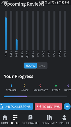
- Decks will have an “unlock lessons” button despite having done all of the lessons for the day. Edit: Doing this causes the home screen to list lessons as available despite all active decks having 0 lessons listed. This persists when switching back to the web app.
- The progress bar for a deck doesn’t have those pretty bars showing how many are begginer/novice/intermediate/expert/master.
- I forgot that it was convenient having a mobile dictionary instead of tabbing to jisho all the time, woohoo!
- For custom decks the unlock lessons, review, and new card buttons will cause the elements to overflow and clip on my device.
- When doing the last item in a review it seems to require clicking enter/forward twice to actually sync and go to the results screen #minorannoyances
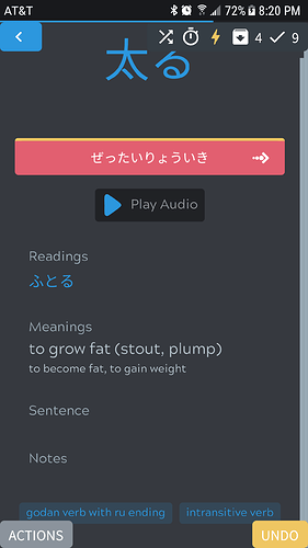
- The default layout looks nice on mobile, but when showing information the actions/undo buttons will clip over the tags a bit when scrolled down.
- It’s clearly WIP, but I found it a bit weird that logout was buried under Profile -> General Settings.
- I am a filthy achievement chaser in games, please don’t do this me :’(
Yes, it’s a crazy password, and no, it doesn’t drive me mad, because I use a password manager  .
.
Which keyboard do you use?
The “unlock lessons” even though there are no lessons to unlock thing has existed on the webapp for a while now.
You get what you deserve you filthy redacted- achievement chaser!
Like phone keyboard? I just use the standard one. I had tried a few in the past, but nothing really clicked with me and the Japanese input was easy on the standard one. Maybe I should have considered a password manager that does the cloud/sync stuff, but the idea doesn’t sit well well with me.
TIL, thanks! Now I can use unlimited lessons without having to acknowledge I’m setting myself up for failure… Seriously, though. I’ve been doing it by toggling unlimited ><
In just occurred to me that even the word SETTINGS is too verbose. Apps seem to use the settings cog on its own without people getting confused. It would probably look nice and clean without any background either.
When doing a dictionary search that returns 0 results the app just shows a blank results screen instead of indicating that a search has returned nothing.
野津町, The Cursed Town of No Result
I think I’d prefer the way it looks right now. I’ve tried that before but it felt off to me.
Someone suggested making the counts on the decks clickable in order to jump right into reviews/lessons. I’m afraid it might be a bit too difficult to tap correctly on the deck itself or one of the lesson/review counts but will check first 
Personal decks have a + button to let you add cards, community decks don’t as you can’t add your own cards there.
This should be fixed with the latest update 
This issue is difficult to be honest. It depends on the layout design too (the top portion is taking a lot of unneeded space there). The card can scroll and put the input in the middle, but with autofocus it would probably cut out a portion of the question of the card (e.g. “one” would be cut out of view). Causing you to have to scroll all the time. Another option is to resize the whole card when the keyboard comes up, but that would lead to a lot of sizing issues (the available space is now ~50% so it becomes very cramped).
The latest update should’ve made the card scaling a lot better on android though, perhaps that already helps?
This is an issue with SwiftKey specifically. They do not respect the HTML standard that tells keyboards to not capitalize the first letter. The Japanese input in kitsun changes to either katakana or hiragana based on whether you type uppercase or lowercase.
A bug report for this has been open at SwiftKey for a while now but they do not seem interested in changing it (now that Microsoft took over I have even more doubts that they will change it  )
)
I believe it currently expires after 7 days of inactivity (like the website) 


As mentioned by others, this is expected behavior for when you want to do more lessons than your daily limit 
Might add those to show on tap!
I’ll be changing these buttons, even more so now that it’s causing issues haha
I’ve heard this from a few users now but have not been able to reproduce it yet. I’ll keep trying!
Yeah I think the fix in this case would be to add more padding to the bottom of the layouts, as doing it globally or in the app itself will lead to black/white bars.
Yep, WIP!
hahaha 
Hmm, it should’ve shown something there I think. Putting it on the list!
Thanks both for the feedback! Appreciate it! 
This is a dumb question, but whenever I do reviews I have to turn on lightning mode back on. I vaguely recall seeing a settings screen that covered some of the preferences when I installed the app, but can’t find it again. Where was it?
There’s a reorder popup when you click on the icon (next to the lightning mode/wrap-up icons), which might be what you’re thinking of?
I forgot to persist the lightning mode setting between sessions. Putting it on the list!
It would be nice if the current view would refresh when reopening the app from the background after an extended period of time. Similarly, it would be nice if there was a way to refresh the data in a view.
Sometimes I’ll leave the app on the home or deck listing, but the information on available reviews and stuff won’t update until I go to a different screen.
Agreed! It’s on my to-do list along with pull-to-refresh gestures 
@Neicudi Sorry to piggyback on this thread but hoping someone can help. I’m brand new to kitsun and am interested in doing something like this post talks about – searching the japanese 10k deck for words found during immersion and bringing them to the front of the lesson queue.
It looks like this is possible on the website via the deck’s Manage Cards view, but I couldn’t find any way to do this in the app. Is such a feature planned for the app, and if so, can you tell me any estimated timeline?
Also, is there anyway to do a sort of global search for new words? For example, (in my head at least) it would be awesome if I could search for a new word and see results from all of my existing decks as well as from jisho. If the word exists in any of my decks (like 10k), it would be great to quick “promote to front” from there. If the word isn’t in any of my decks, the jisho results would still be visible right there for me to create new cards from. This way I wouldn’t have to search multiple locations for new words.
Thanks!
Hey! Sorry for the delayed response, I’m currently on a small holiday break.
It definitely is! For larger decks this might be a little bit challenging however as it can be a lot of data to display/have in memory, but I think it should be alright 
I’m afraid that’s currently not possible. The problem lies in templates being completely dynamic and that they can contain not just a few values but also large amounts of text (e.g. many, many definitions or even large text excerpts from books), so indexing these fields properly is challenging. Without proper indexing it is also very difficult to efficiently search through cards. Kitsun currently has a workaround that shifts this searching/sorting/filtering to the client-side rather than the server-side. Making all decks searchable at once would then require all cards to be loaded on the server-side, which would probably crash the browser due to memory limitations.
Long story short: Sadly, currently not really possible, but perhaps it might be in the future as we expand Kitsun’s tech-stack with search-focused databases and such.
Have you considered ES? 
Oh you. 
On flip cards, on Android app KNOW is on the right and DON’T KNOW is on the left while on the website, KNOW is on the left and DON’T KNOW is on the first, that’s… disturbing (and I missed a few reviews because of this  )
)
I love using the app as I’m often reading books in bed and can look up a lot of vocab in it. However a problem arises when I try to add cards from there. It appears the default card layout setting for a deck is completely ignored. I also can’t find an option to select a layout for cards when adding from dictionary in the app. This means that I can’t start reviewing them without first going into manage cards on the website and fixing all the layouts. Which I prefer to do on my computer.
Am I missing something somewhere to make this all work? 


