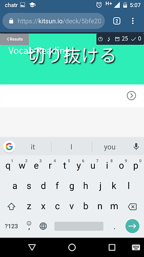
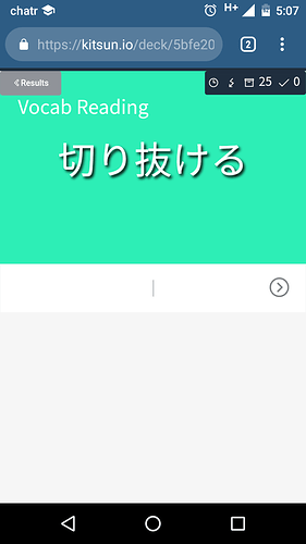
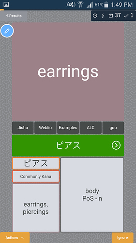
Mobile site reviews and ignore button

The text input box is pushed upwards when the keyboard is brought up, causing the word to become harder to read. I don’t think the gray space under the text box should be there during reviews.

Also the ignore button should probably be on the bottom left and not the right because the enter button for my keyboard is bottom right, causing me to misclick ignore a lot and have to retype a lot.

Sorry about formatting, am on mobile atm.


EDIT: my phone is a moto g3 and I’m running the latest version of chrome if that helps
EDIT2: the more info tab is also expanded by default, which I’m not sure is intended because it spoils your reviews. Eg, you don’t know the reading but you get the meaning card right and see the reading by default

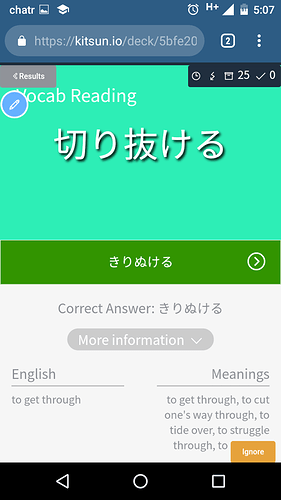
1 Like

I can also think of some formatting improvements for mobile :slight_smile:

For example the show, know/don’t know and ignore buttons are microscopic on iPad, you need fine fingers to proceed. They also often end up out of screen for scrolling on the 10k at least, even if there is not so much stuff on front.

Having no return or space key is really inconvenient, tapping anywhere to continue would be nice.

1 Like

I believe this is default behavior for browsers when the keyboard pops up. I’ve searched for a solution to this before but was unable to find one. I’ll put it on the list and take another look soon in case I missed something.

Alright, that does seem like a good enough reason to move it. It does bring the risk of miss-clicking the android ‘back’ button though :stuck_out_tongue:

I’ll try to implement a tablet specific mediaquery where the buttons are larger :slight_smile:

This should be fixed in the next update I think (kinda hard to confirm for iOS devices since I don’t have one) the buttons should now always be visible without having to scroll down.

The iOS keyboard has no ‘enter’ key to continue? Is this a general issue or just with Kitsun?

I mean when you look at the front of a card or on a input backside there is no keyboard up to press space or enter, so you have to search and tap the next button for example while on PC this is very convenient to skip :slight_smile:

@tehdunsparce but the action button is already on the left.

I’d suggest something different. A swipe to move to the next card when already answered correctly. In other words, in the above screenshot, instead of me having to go from Enter => clicking :arrow_forward:, I’d know that after enter, I’d swipe from right to left.


Another idea would be to add the “Ignore button” to the input box. So we’d have both :arrow_backward: and :arrow_forward:.


I personally prefer my first idea. It’s less messy imo.

1 Like