
Just saying. If I accidentally click delete, and I’m in a hurry, I might click the “Yes, delete it” button too. Played too many video games to know that.
2 Likes
Is there any other place you would suggest?
2 Likes
At the bottom of the page would probably be the best position for it in my opinion. That way you´d only be able to delete it intentionally.
1 Like
Hmm, I get what you’re saying but at the same time, that’s what the extra popup asking for confirmation is there for 
We could space the buttons horizontally to make the situation less likely to happen?
So something like this (or the buttons reversed):
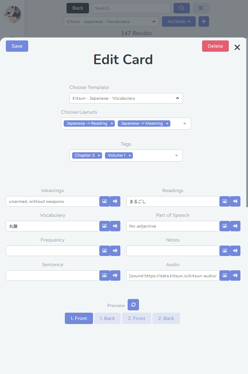
Do you think that’d work?
1 Like
I think this but reversed looks good, but I also think that there’s a scarier one in the deck settings 
2 Likes
I was talking about the really scary one in the deck settings 
A delete button right next to a save button on a massive deck is super scary. I’ve misclicked “confirm” buttons many times in stuff like games. I think some software includes “type the name” of the item you want to delete approaches. But I think just moving the delete button away from the save button will probably be more than enough.
I really like Kitsun btw. Just wanted to point this one thing out as it really stood out to me 
3 Likes
Oh gotcha!
I’ll either move it or introduce a “Type ‘Delete’ to confirm” kinda popup (or both).
I think your concern is definitely valid when it comes to that one, so I’ll put it on the prio list  Thanks for mentioning it!
Glad you like it so far 
3 Likes