Editing card improvements

This will probably become irrelevant if at some point sentences can be added when generating flashcards from a dictionary but for now, please bear with me.

So, I am creating my deck based on a vocab book by using the Dictionaries tab, searching jisho.org, generating a bunch of flashcards relevant to a specific section in the vocab book, and then manually editing each newly added card to include an example sentence.

The problem is the process of editing the cards is incredibly tedious. I have to select the card, add the sentence, click “Save”, then click “Back”, select the next card for editing and then repeat.

I guess what I’m mostly after if a way of being able to select a card for editing, saving my edits and then moving directly to the next card (or previous card) in the deck - in essence forward and back arrows that allow me to move through cards in the deck.

(also, perhaps an auto-save setting that basically waits for a period of X seconds from the last edit and then saves, although I imagine that would also require an undo feature as well, but having to click “Save” all the time is getting mildly tedious)

By the way, if I haven’t said it amongst all of these bugs/FRs I’ve been dumping in the past two days, Kitsun is excellent and I will certainly be happy to pay real money to keep on using it and to support its continuing development (on that note, did I register early enough for a discount? :wink:)

2 Likes

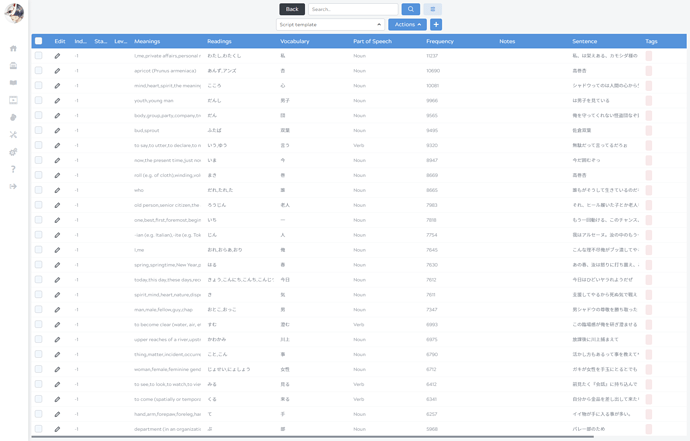
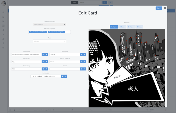
The redesign will have a much easier management system, here’s some screenies of how it will look:

^ Big table that loads all of your data at once (instead of per 100)

^ Clicking the pencil button will open a popup, rather than redirect to a new page.

Aside from this, it will be much easier to sort through your cards and apply management actions (e.g. setting tags or layouts) to your selection of cards :slight_smile:

The feedback you’ve given is great, and are all valid points. Please don’t hesitate to provide more feedback, it’s very valuable :smile:

Thanks for the compliments, glad you like it!

I’ve just checked and your account creation date is 2019-01-30 so I’m afraid you sadly aren’t eligble for the closed beta discount.

2 Likes

So, I’ve been trying out the new design and so far it’s been excellent.

One minor quibble however. When I edit a card and click “Save”, the animated circle indicating that the save is in progress appears in both the Save and the Delete buttons. This was mildly disconcerting as for a second I thought I had deleted the card instead of saving it.

Would it be a pain to ensure that the animation is only displayed in the button that was actually clicked?

1 Like

Hmm, the reasoning behind showing a spinner is that it indicates that something else is already awaiting answer from the server, meaning you can’t do other actions right now.

I get where your confusion comes from though. I’m not sure what would be the best solution in this case. I think I personally prefer having the spinner indicate that Kitsun is busy, on all possible actions/buttons.