Is there a way to change the background or font color depending on whether a reading or meaning is being prompted for? I’m finding that when I am going through the reviews too fast, I’ll put in the wrong answer type and then get the card wrong which is honestly pretty annoying. This is only my second day trying kitsun.io, and I really like being able to use of premade decks, but I would really appreciate this quality of life feature.
Welcome!
This depends on the deck you are using and how the layouts of the cards are designed.
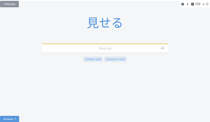
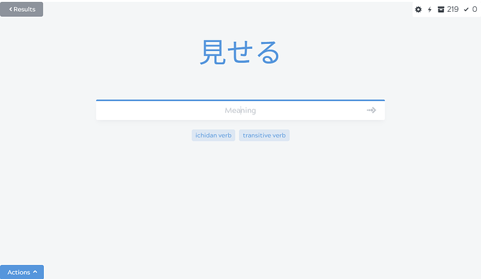
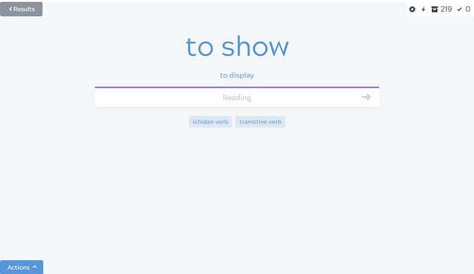
For the default Kitsun layouts (also used in the N5-N1 decks) the color of the bar above the input changes color to indicate what type of answer is requested.
Here’s the difference between the default layouts:
Japanese -> Reading
Japanese -> Meaning
Meaning -> Reading
For other community (premade/shared) decks it depends on the designs of the authors. So it kinda depends on which decks (and therefor which layouts) you use 
Oh I see! Is there a guide on how to customize the layout somewhere? Or rather how to change the layout of an existing deck? I know how to create my own layout but I don’t see where I can customize an existing one.
Community Deck designs are only tweakable by the authors. Which deck in particular are you struggling with? Often it’s a matter of getting used to it or taking a little bit more time to read the input placeholder/colors ^^
But perhaps something can be changed based on the feedback you give them though. Most authors are pretty receptive of feedback.
I’m just going through the N5 deck right now, and I’m loving the SRS system. I just wish I could tailor the deck and format to myself a little bit more.


