Is there any built in way to share layouts or copy layouts from community decks?
There isn’t at the moment, although I do have plans to create a special section in the community centre for sharing layouts 
That said, some creators probably wouldn’t mind sharing their layouts through other means until that gets implemented.
I’m trying to create a layout for a geography deck I’m making, but there doesn’t seem to be any easy way of creating or editing existing layouts without going deep into the code. Is there a simpler way of doing things?
What exactly would you like to do? Do you have any examples of what you’d like to create?
I’ve been working on a layout editor where you can make layouts with a few clicks and dragging elements into the canvas, but it’s not anywhere near done yet. So it’s coming but it will still take a while.
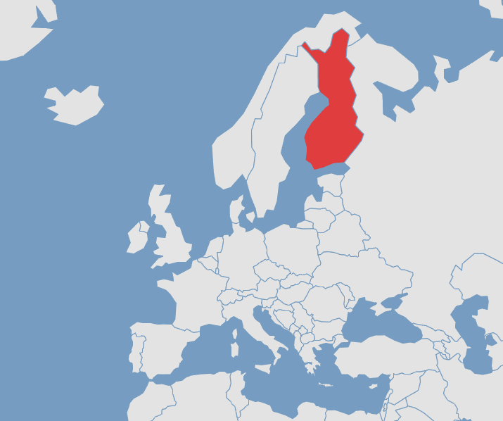
I’ve created this template already
I’d like to have an image on the front of the card, with the image and the answer (the country) on the back, with the other fields below.
Alright! If you want I can help you set up a nice layout or I can give you a step by step guide on how to do it yourself  (it’s actually not that hard to do)
Would you want an input field in there? Would the current default templates suffice if you can just add an image to the front instead of the text?
Let’s make something cool  I got some time to help since I’m being sick in bed anyways
Edit:
We could also use a svg and make the countries/cities etc clickable like the deck @acm2010 has
Yeh! So basically I want the map on one side, and a text field to guess the country, then on the other side it has the correct answer with the map, and then the additional information below.
I made some maps earlier, so each one basically has a different country highlighted:
I did find some svg images yesterday when I was trying to figure out the best way of doing it, but I’m not entirely sure how it would function.  I definitely want a text input for the answer though.
The idea with svg images is that you can click on any element inside of it (e.g. a country) and it will flip the card. With some Kitsun “magic” (basically, multiple choice where every country is a choice) it will then highlight the correct country on the backside (like in your picture) and also show you which country you clicked.
However, if you only want an input, then that’s fine as well, it’d be a bit easier to create 
So, you could be given the name of the country instead, and you would have to select the country on the map? I like that idea, but I think I’d like to stick with just the regular images, even if it is less flashy  . I like the idea of having to type out the answers in reviews.
Alright! I can create a basic setup under that template if you’d like. It might be a bit easier to discuss this on Discord if you’re fine with that  You could join the Kitsun discord (https://discord.gg/MJP29gf) or message me privately on there @ Neicudi#8494
Some small modifications to my standard Kitsun layout for a Conjugation deck I am working on. No telling when I will get this done. 56 layouts in one deck is a beastly undertaking.

Isn’t there a way to simplify everything into one layout that changes with IF/OR logic? (imagine 57 IF/OR syntaxes(?) in one layout. Nice stress testing  )
)
I have at least three different if/or logics going already. I can barely keep them straight as it is.

Hinekidori-san, you are AWESOME!
Thank you! There Are Ten Ants…wait no, I meant Thank you in japanese…damn homophones!

Hi all, I’m new to this excellent site, and I admit that I don’t really understand the layout aspect - or even whether this is the correct thread for my question!
I’m starting off with the “Kitsun - JLPT - L4”, “Kitsun - JLPT - L5” and “10k - Kitsun Optimized” decks to get use to things.
For reviews in the 10k - Kitsun Optimized deck, it shows “Vocabulary Meaning” or “Vocabulary Reading” above the text entry field. However with the JLPTL4/L5 decks, the only indication of what type of entry is required is a colour change, which I can’t seem to click with.
Is there any way to modify the JLPTL4/L5 decks to include “Vocabulary Meaning” / “Vocabulary Reading” text strings, as appropriate?
You can think of a layout as the looks of a card. Each layout per card results in a “sibling card” during lessons and reviews. Meaning that each layout creates a specific type of card.
The Kitsun N5 & N4 decks were made by me, using layouts and templates which are now deprecated.
The bad news is that this also means that I am the only one who can change the layouts (and with that the cards that you see during lessons and reviews).
The good news is that I have plans to update those decks to the new default layouts and can definitely add those text prompts while at it  It will be after launch though… I can probably quickly add a small prompt into those layouts through the database as a temporary fix. I’ll put it on the to-do list.
Thanks so much. No rush, obviously!
I see you snuck that in quickly! Is it possible to put it centred, just above the text entry field?


