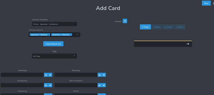
- (EDIT: Didn’t know there was a keyboard shortcut for this) Could the Add Card page be edited so the “Save” button is closer to the text input fields? I have to mouse all the way over to the top right to ‘save’ a card.
- Could this page generally have the empty space shrunk or layout reimagined? On my 1080p monitor, I have to scroll down to see all the input fields, which gets annoying when adding lots of cards. Doing so will hide the Save button, so then I have to scroll back up. Or more generally, I rarely need to change all of the info on the top left (Template/Layout), but I always need to edit the text fields below.
1 Like
In case not aware, Command-S works just the same on Kitsun
2 Likes
Didn’t know this. Thanks!
2 Likes
Hey @hantani!
Thanks for the feedback! I’d definitely like to revisit that popup again to clean up the design a bit more in the near future, so your feedback is definitely noted!
1 Like

