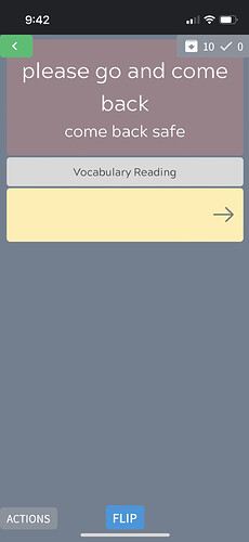
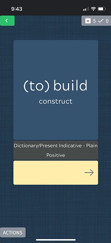
I’m testing using the app on iPhone and so far I’m loving it. Let’s face it, I’m only ever going to uses this as an app on my phone! So glad y’all are putting so much work into the app. Just had two things that are really annoying me so far.
First: can there be a settings option that you turn on so the when you enter the correct answer, it automatically goes to the next card in the deck without you having to click the next arrow again?
This might sound a little silly but having to click the across arrow a second time to go to a new card after I’ve typed in the correct answer is actually really annoying. Like really really really super annoying. Like it makes me want to stop doing reviews because I have to click the button too many times to get to the next Card… if I’ve gotten it correct I don’t need to see all the meaning information again, I just need the next card in the deck. i’m one of those people who would power through 100 Wanikani reviews I’m like 10 minutes and would like to do the same here but this app is slowing me down and it’s difficult to get into a real rhythm with it.
Second: is there a way to flip decks in the lesson study mode? In these decks, the first thing you see when you start a lesson is the English version of the card. I want the Japanese to come up first so I can look at the kanji study it and maybe take a guess at the meaning before actually looking at and learning the English meeting. I know some people might want to see the English first so I think it would be useful if there was an option to flip it to choose which card or version comes up first. This isn’t a dealbreaker for me but it would just be a lot more convenient when studying. The thing I mentioned above about having to click to go to the next card when reviewing is a dealbreaker so please fix that first.


 During reviews you can enable “lightning mode” which does exactly what you’d want. You can do this by tapping on the lightning bolt icon in the top-right (during reviews only, not lessons).
 things has brought untold joy! Thanks. But I’m still getting an issue where I type the right answer and it goes To the next card, great, but the keyboard disappears and I have to click the space to type the answer for the keyboard to reappear. Is there anyway to adjust it so that the cursor is already there and the keyboard stays where it is so all I just have to do is type in the next answer instead of having to click the space for the cursor have the keyboard come up and then type in the next answer? Not sure if that explanation makes sense…maybe it’s a setting that’s already there that I just missed?..